> ## Documentation Index
> Fetch the complete documentation index at: https://axiom.co/docs/llms.txt
> Use this file to discover all available pages before exploring further.
# Configure dashboard elements
> This section explains how to configure dashboard elements.
When you create a chart, click to access the following options.
## Values
Specify how to treat missing or undefined values:
* **Auto:** This option automatically decides the best way to represent missing or undefined values in the data series based on the chart type and the rest of the data.
* **Ignore:** This option ignores any missing or undefined values in the data series. This means that the chart only displays the known, defined values.
* **Join adjacent values:** This option connects adjacent data points in the data series, effectively filling in any gaps caused by missing values. The benefit of joining adjacent values is that it can provide a smoother, more continuous visualization of your data.
* **Fill with zeros:** This option replaces any missing or undefined values in the data series with zero. This can be useful if you want to emphasize that the data is missing or undefined, as it causes a drop to zero in your chart.
## Variant
Specify the chart type.
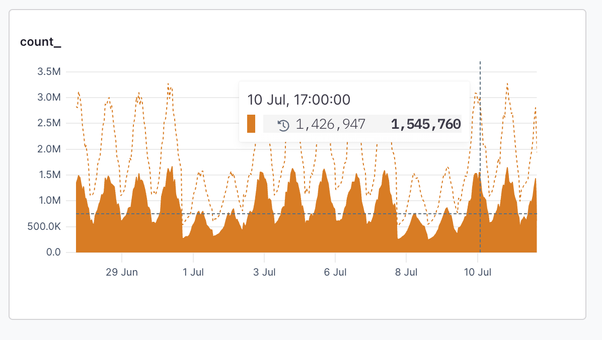
**Area:** An area chart displays the area between the data line and the axes, often filled with a color or pattern. Stacked charts provide the capability to design and implement intricate query dashboards while integrating advanced visualizations, enriching your logging experience over time.
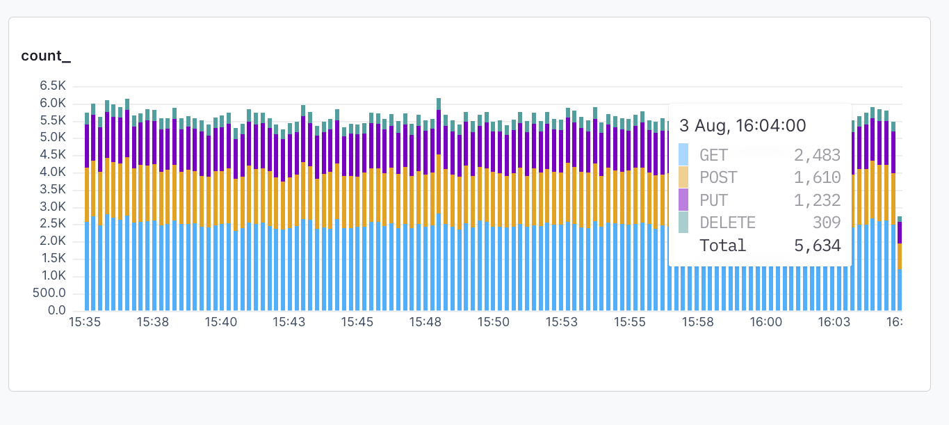
 **Bars:** A bar chart represents data in rectangular bars. The length of each bar is proportional to the value it represents. Bar charts can be used to compare discrete quantities, or when you have categorical data.
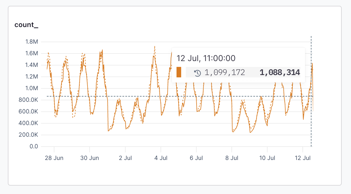
 **Line:** A line chart connects individual data points into a continuous line, which is useful for showing logs over time. Line charts are often used for time series data.
 ## Y-Axis
Specify the scale of the vertical axis.
**Linear:** A linear scale maintains a consistent scale where equal distances represent equal changes in value. This is the most common scale type and is useful for most types of data.
## Y-Axis
Specify the scale of the vertical axis.
**Linear:** A linear scale maintains a consistent scale where equal distances represent equal changes in value. This is the most common scale type and is useful for most types of data.
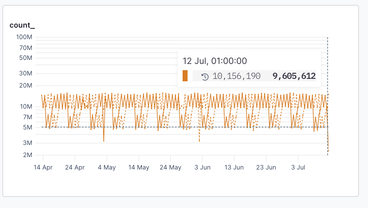
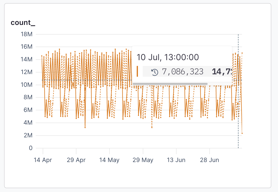 **Log:** A logarithmic (or log) scale represents values in terms of their order of magnitude. Each unit of distance on a log scale represents a tenfold increase in value. Log scales make it easy to see backend errors and compare values across a wide range.
 ## Annotations
Specify the types of annotations to display in the chart:
* Show all annotations
* Hide all annotations
* Selective determine the annotations types to display
## Annotations
Specify the types of annotations to display in the chart:
* Show all annotations
* Hide all annotations
* Selective determine the annotations types to display