> ## Documentation Index
> Fetch the complete documentation index at: https://axiom.co/docs/llms.txt
> Use this file to discover all available pages before exploring further.
# Gauge
> This section explains how to create gauge dashboard elements and add them to your dashboard.
export const elementName_0 = "gauge"
export const elementButtonLabel_0 = "Gauge"
Gauge dashboard elements compare a single numeric value with colored segments. Use a gauge to show whether a current value, such as an error count or average response time, is within an expected range.
## Prerequisites
* [Create an Axiom account](https://app.axiom.co/register).
* [Create a dataset in Axiom](/docs/reference/datasets) where you send your data.
* [Send data](/docs/send-data/methods) to your Axiom dataset.
* [Create an empty dashboard](/docs/dashboards/create).
## Create {elementName_0}
1. Go to the Dashboards tab and open the dashboard to which you want to add the {elementName_0}.
2. Click **Edit dashboard**.
3. Click **Add element** in the top right corner.
4. Click **{elementButtonLabel_0}** from the list.
5. Choose one of the following:
* Click **Builder** to create your chart using a visual query builder. For more information, see [Create chart using visual query builder](/docs/dashboard-elements/create#create-chart-using-visual-query-builder).
* Click **APL** to create your chart using the Axiom Processing Language (APL). Create a chart in the same way you create a chart in the [Editor of the Query tab](/docs/query-data/query-editor).
6. Optional: [Configure the dashboard element](/docs/dashboard-elements/configure).
7. Click **Save**.
The new element appears in your dashboard. At the bottom, click **Save** to save your changes to the dashboard.
## Configure gauge segments
Use the segment rail to configure the ranges:
1. Enter exact boundary values in the inputs above the rail, or drag a boundary handle.
2. Click the scissors control inside a segment to split that segment.
3. Click the remove control below a shared boundary to merge the adjacent segments.
For a row-based view, expand **Edit segment values**. Enter the **From** and **To** values for each segment, or use **Split segment** and **Remove**. Each segment starts where the previous segment ends.
The selected color scale assigns a color to each segment.
## Configure gauge display
Configure the gauge with the following options:
* **Sparkline**: Display the value over time inside the gauge.
* **Color scale**: Apply colors from green to red or from red to green.
* **Labels**: Display evenly spaced **Intervals**, segment **Boundaries**, or no labels. **Intervals** is the default.
* **Scale to time range**: Scale segment values in proportion to changes in the dashboard time range. Enable this option for count and sum thresholds that represent the chart's saved time range.
* **Custom units**: Display a unit after the gauge value.
## Query requirements
Gauge queries return one numeric series. In Builder, add exactly one aggregation and leave **Group by** empty. In APL, use a `summarize` or `count` statement. If the query contains `summarize`, return one expression from the last `summarize` statement and group only by `_time`, if at all.
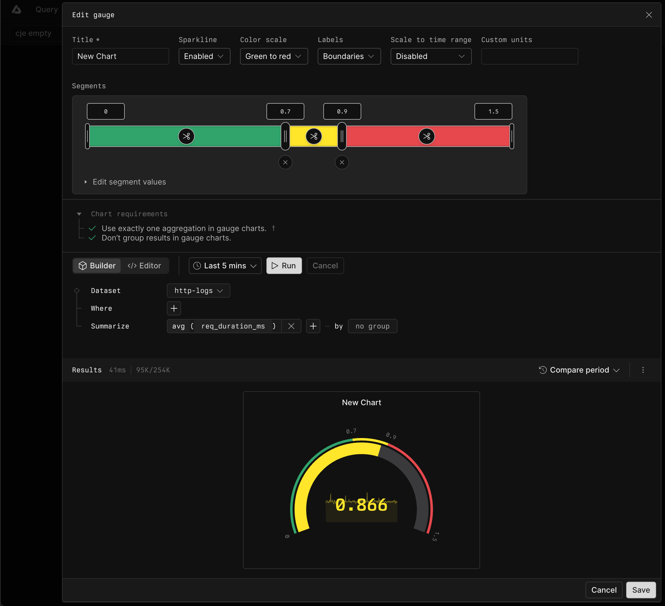
## Example with Builder
In Builder, summarize `req_duration_ms` with the `avg` aggregation.
 ## Example with APL
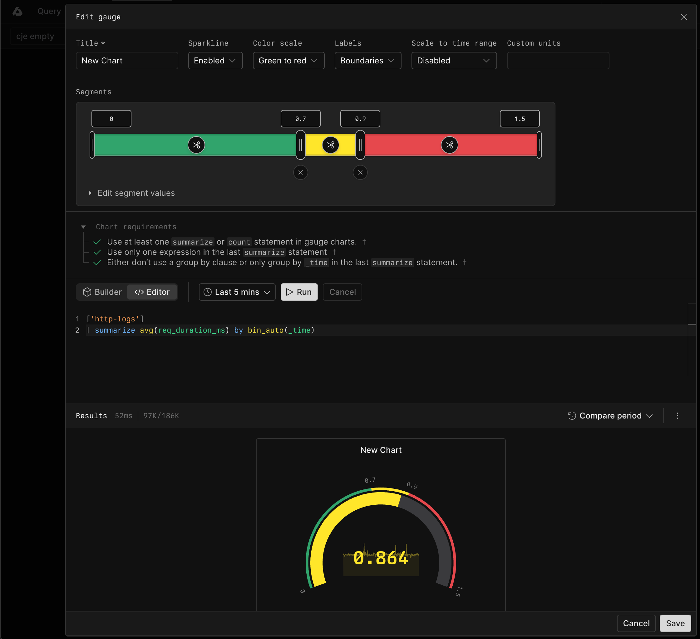
```kusto theme={null}
['sample-http-logs']
| summarize avg(req_duration_ms) by bin_auto(_time)
```
## Example with APL
```kusto theme={null}
['sample-http-logs']
| summarize avg(req_duration_ms) by bin_auto(_time)
```