> ## Documentation Index
> Fetch the complete documentation index at: https://axiom.co/docs/llms.txt
> Use this file to discover all available pages before exploring further.
# Heatmap
> This section explains how to create heatmap dashboard elements and add them to your dashboard.
export const elementName_0 = "heatmap"
export const elementButtonLabel_0 = "Heatmap"
Heatmaps represent the distribution of numerical data by grouping values into ranges or buckets. Each bucket reflects a frequency count of data points that fall within its range. Instead of showing individual events or measurements, heatmaps give a clear view of the overall distribution patterns. This allows you to identify performance bottlenecks, outliers, or shifts in behavior. For instance, you can use heatmaps to track response times, latency, or error rates.
## Prerequisites
* [Create an Axiom account](https://app.axiom.co/register).
* [Create a dataset in Axiom](/reference/datasets) where you send your data.
* [Send data](/send-data/methods) to your Axiom dataset.
* [Create an empty dashboard](/dashboards/create).
## Create {elementName_0}
1. Go to the Dashboards tab and open the dashboard to which you want to add the {elementName_0}.
2. Click **Add element** in the top right corner.
3. Click **{elementButtonLabel_0}** from the list.
4. Choose one of the following:
* Click **Builder** to create your chart using a visual query builder. For more information, see [Create chart using visual query builder](/dashboard-elements/create#create-chart-using-visual-query-builder).
* Click **APL** to create your chart using the Axiom Processing Language (APL). Create a chart in the same way you create a chart in the [Editor of the Query tab](/query-data/query-editor).
5. Optional: [Configure the dashboard element](/dashboard-elements/configure).
6. Click **Save**.
The new element appears in your dashboard. At the bottom, click **Save** to save your changes to the dashboard.
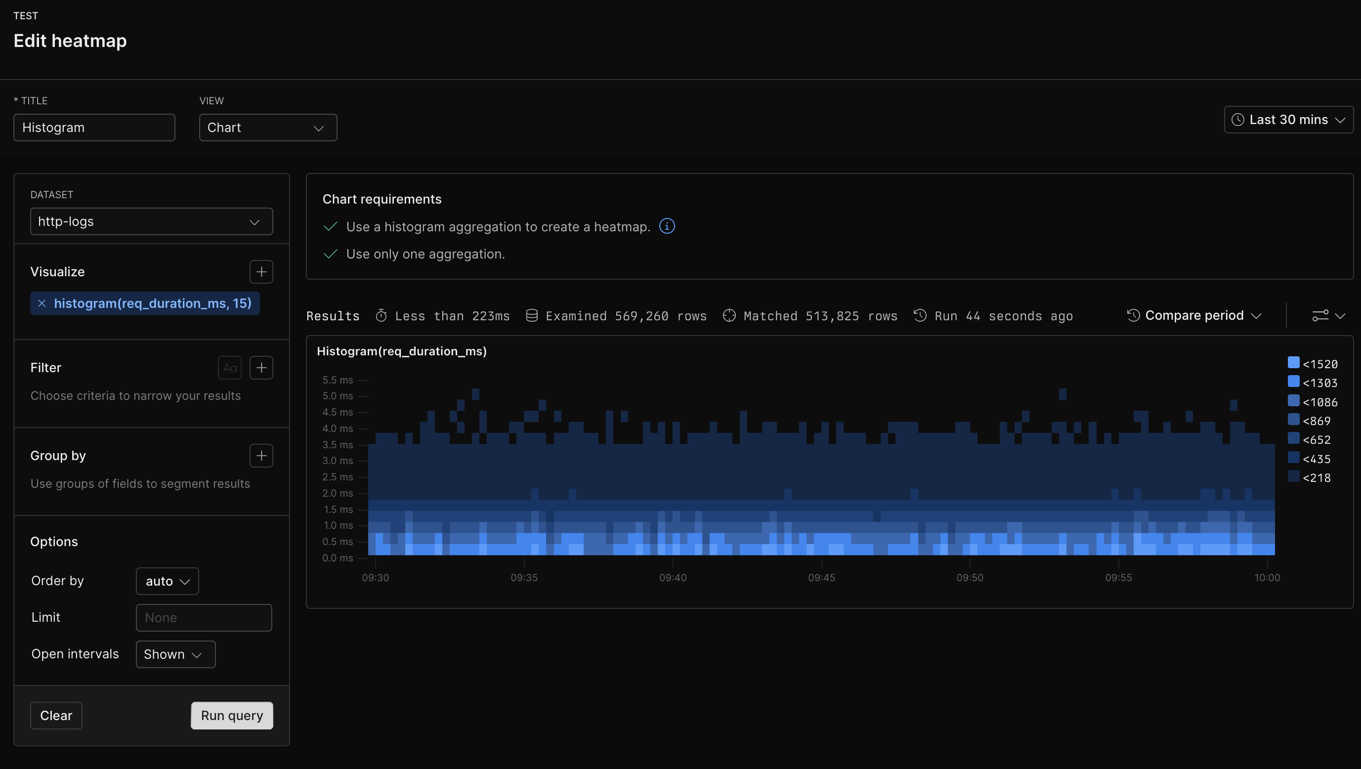
## Example with Builder
 ## Example with APL
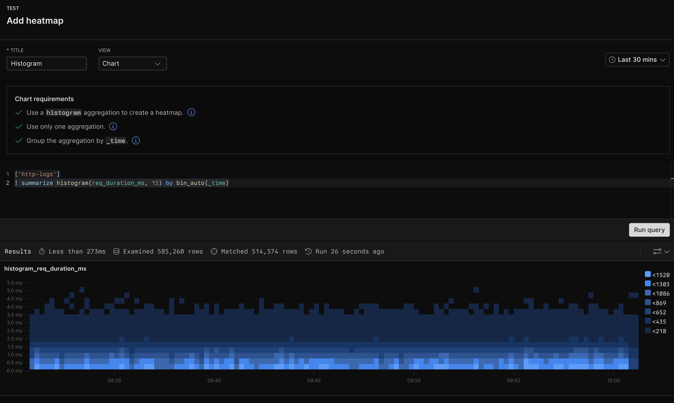
```kusto theme={null}
['sample-http-logs']
| summarize histogram(req_duration_ms, 15) by bin_auto(_time)
```
## Example with APL
```kusto theme={null}
['sample-http-logs']
| summarize histogram(req_duration_ms, 15) by bin_auto(_time)
```