> ## Documentation Index
> Fetch the complete documentation index at: https://axiom.co/docs/llms.txt
> Use this file to discover all available pages before exploring further.
# Pie chart
> This section explains how to create pie chart dashboard elements and add them to your dashboard.
export const elementName_0 = "pie chart"
export const elementButtonLabel_0 = "Pie"
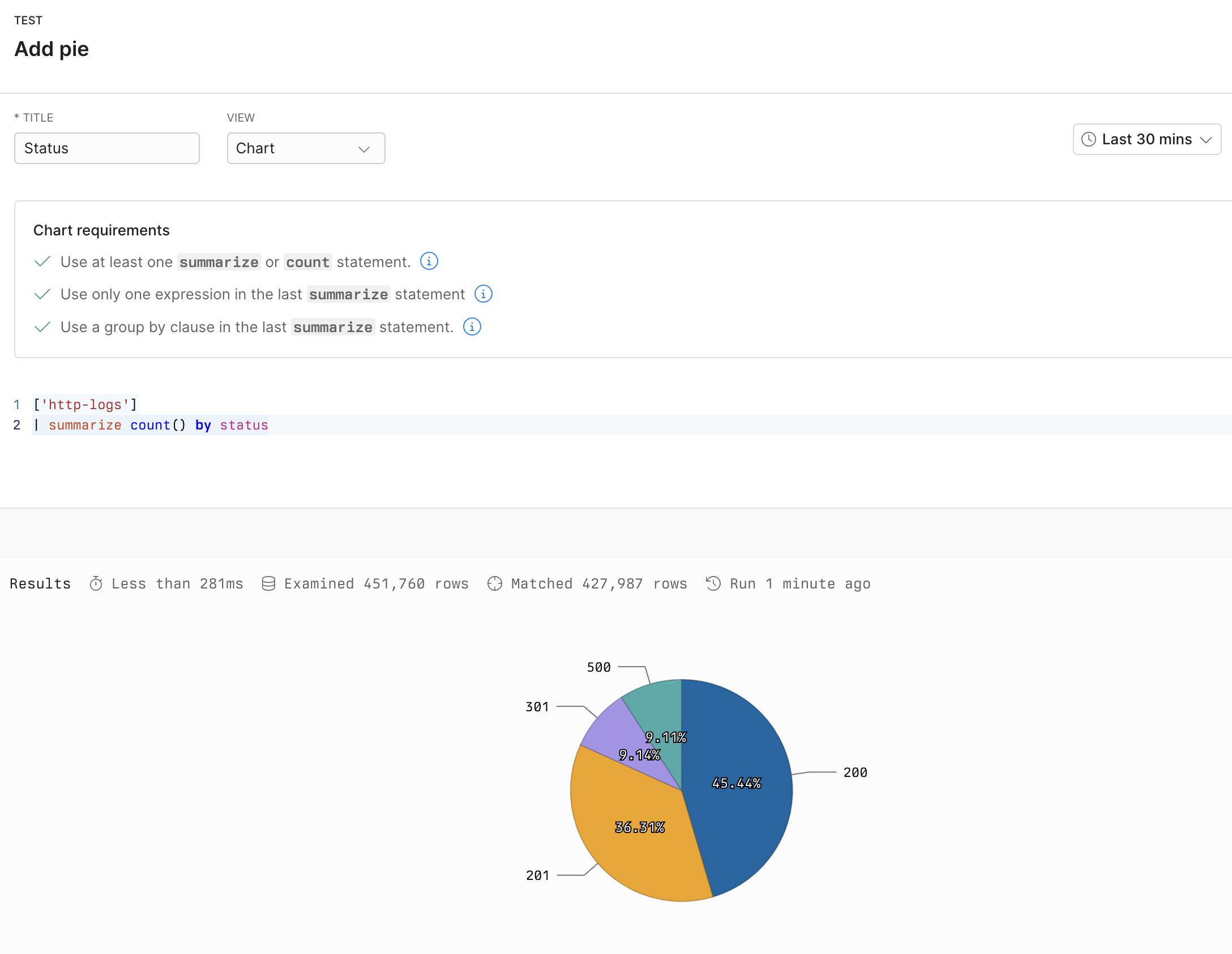
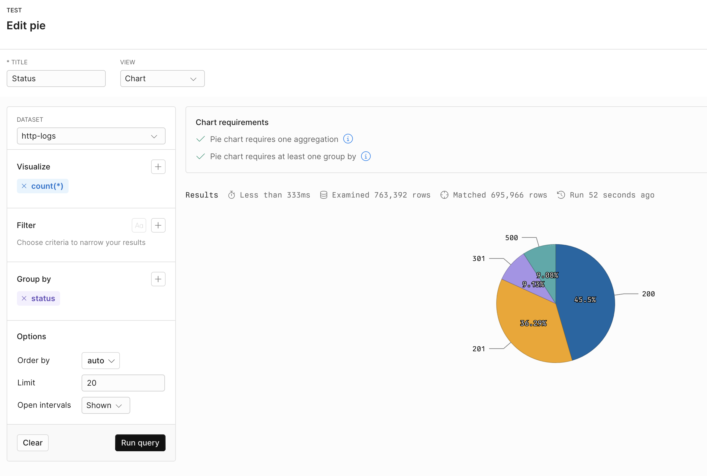
Pie charts can illustrate the distribution of different types of event data. Each slice represents the proportion of a specific value relative to the total. For example, a pie chart can show the breakdown of status codes in HTTP logs. This helps quickly identify the dominant types of status responses and assess the system’s health at a glance.
## Prerequisites
* [Create an Axiom account](https://app.axiom.co/register).
* [Create a dataset in Axiom](/reference/datasets) where you send your data.
* [Send data](/send-data/methods) to your Axiom dataset.
* [Create an empty dashboard](/dashboards/create).
## Create {elementName_0}
1. Go to the Dashboards tab and open the dashboard to which you want to add the {elementName_0}.
2. Click **Add element** in the top right corner.
3. Click **{elementButtonLabel_0}** from the list.
4. Choose one of the following:
* Click **Builder** to create your chart using a visual query builder. For more information, see [Create chart using visual query builder](/dashboard-elements/create#create-chart-using-visual-query-builder).
* Click **APL** to create your chart using the Axiom Processing Language (APL). Create a chart in the same way you create a chart in the [Editor of the Query tab](/query-data/query-editor).
5. Optional: [Configure the dashboard element](/dashboard-elements/configure).
6. Click **Save**.
The new element appears in your dashboard. At the bottom, click **Save** to save your changes to the dashboard.
## Example with Builder
 ## Example with APL
```kusto theme={null}
['sample-http-logs']
| summarize count() by status
```
## Example with APL
```kusto theme={null}
['sample-http-logs']
| summarize count() by status
```