> ## Documentation Index
> Fetch the complete documentation index at: https://axiom.co/docs/llms.txt
> Use this file to discover all available pages before exploring further.
# Scatter plot
> This section explains how to create scatter plot dashboard elements and add them to your dashboard.
export const elementName_0 = "scatter plot"
export const elementButtonLabel_0 = "Scatter"
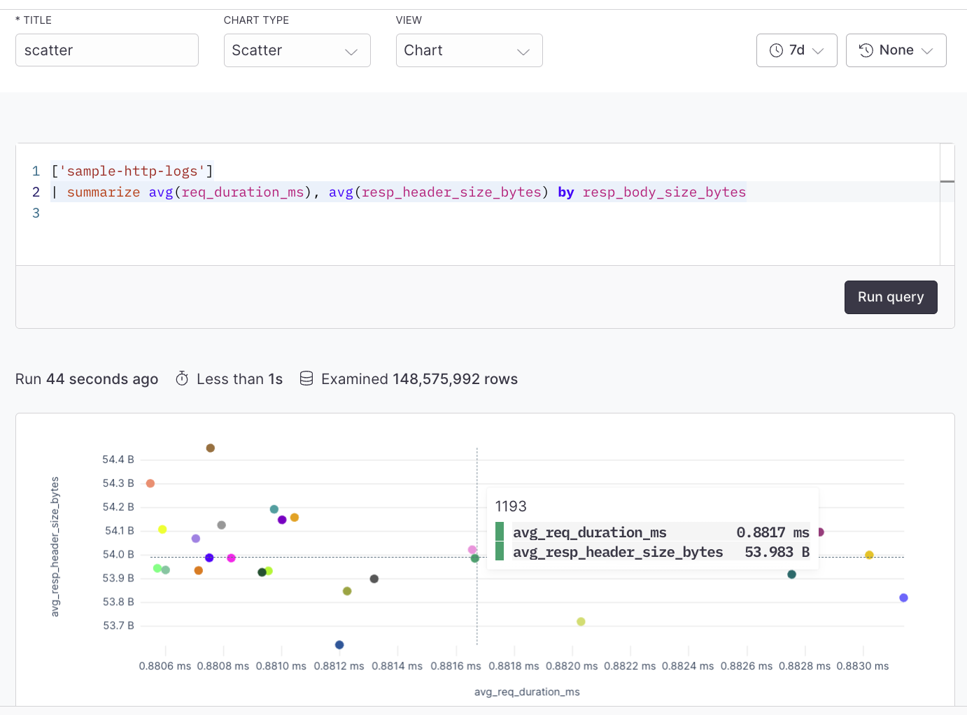
Scatter plots are used to visualize the correlation or distribution between two distinct metrics or logs. Each point in the scatter plot could represent a log entry, with the X and Y axes showing different log attributes (like request time and response size). The scatter plot chart can be created using the simple query builder or advanced query builder.
For example, plot response size against response time for an API to see if larger responses are correlated with slower response times.
## Prerequisites
* [Create an Axiom account](https://app.axiom.co/register).
* [Create a dataset in Axiom](/reference/datasets) where you send your data.
* [Send data](/send-data/methods) to your Axiom dataset.
* [Create an empty dashboard](/dashboards/create).
## Create {elementName_0}
1. Go to the Dashboards tab and open the dashboard to which you want to add the {elementName_0}.
2. Click **Add element** in the top right corner.
3. Click **{elementButtonLabel_0}** from the list.
4. Choose one of the following:
* Click **Builder** to create your chart using a visual query builder. For more information, see [Create chart using visual query builder](/dashboard-elements/create#create-chart-using-visual-query-builder).
* Click **APL** to create your chart using the Axiom Processing Language (APL). Create a chart in the same way you create a chart in the [Editor of the Query tab](/query-data/query-editor).
5. Optional: [Configure the dashboard element](/dashboard-elements/configure).
6. Click **Save**.
The new element appears in your dashboard. At the bottom, click **Save** to save your changes to the dashboard.
## Example with Builder
 ## Example with APL
```kusto theme={null}
['sample-http-logs']
| summarize avg(req_duration_ms), avg(resp_header_size_bytes) by resp_body_size_bytes
```
## Example with APL
```kusto theme={null}
['sample-http-logs']
| summarize avg(req_duration_ms), avg(resp_header_size_bytes) by resp_body_size_bytes
```