Analyzing data
The Datasets tab allows you to gain insights from your data visually.
Rather than inspect individual events, you can run aggregations across all or a subset of events in a dataset and visualize the output. Queries can be crafted to get any level of detail from results, and are easily saved for future use as well as being easy to share with team members.
This section introduces the Datasets tab and its components that unlock powerful insights from your data.
Select a dataset
As all events in Axiom reside in a dataset, first choose a dataset to analyze. When no dataset is chosen, you are presented with a list of your datasets and quick-access panels for recent Starred Queries and Query History (see Dataset Overview for more detail):
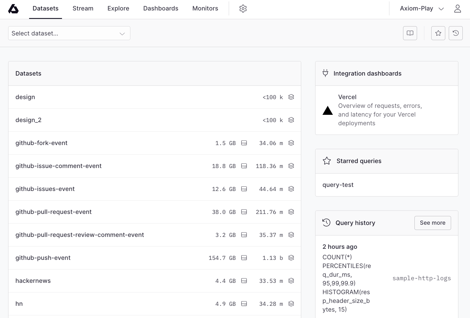
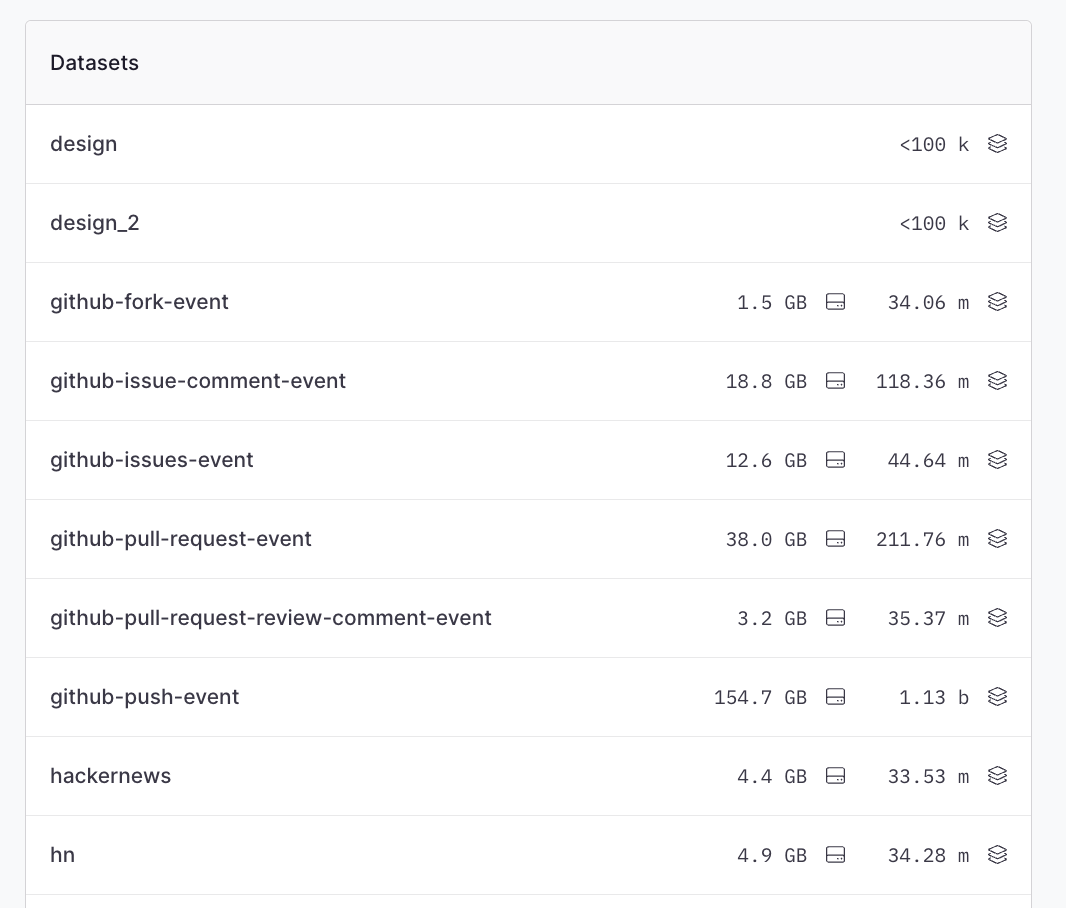
Select a dataset from the list of datasets:
Dataset overview
After selecting a dataset, you see an overview of the dataset, its fields, starred queries, query history, and the query builder:
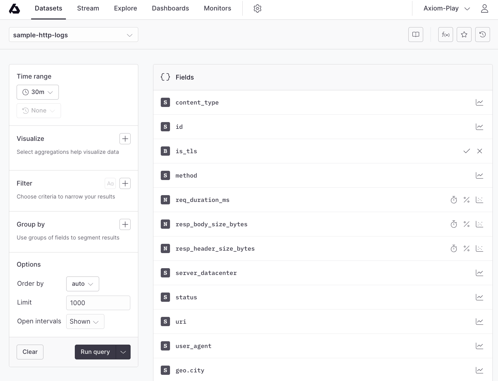
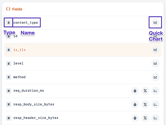
Fields List
The fields list gives an overview of all fields from all events that are in this dataset.
Field Type
- Supported types are:
stringnumberbooleanarray
- Field names are flattened with dot-notation so an event like
{"foo": { "bar": "baz" }}as a field calledfoo.bar
Field name
Field names match the JSON specification. Field names containing periods (.) are folded.
If you get a 400 when you use the field name _time with the Elastic Search endpoint or when you override the timestamp field, use the query parameter ?timestamp-field to set a field as the time field.
Quick charts
Quick charts allow fast charting of fields depending on their field type. For example, number fields have quick charts for easily visualizing percentiles, averages, and histograms.
Virtual fields
Virtual fields are powerful expressions that run on every event during a query to create new fields. The virtual fields are calculated from the events in the query using an APL expression. They're similar to tools like derived-columns in other products but super-charged with an expressive interpreter and with the flexibility to add/edit/remove them at any time.
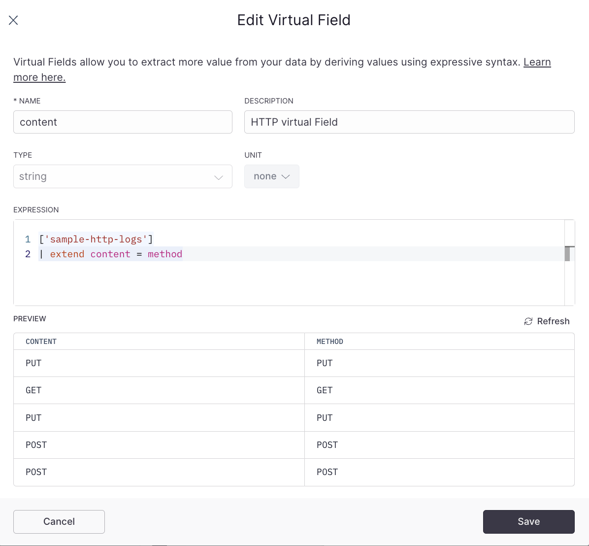
Click Virtual fields on the toolbar to manage of a dataset's virtual fields.
Starred queries
Starred queries are queries saved for future use. They're great for keeping a list of useful queries for a dataset. All starred queries are shared with your team.
Click Starred queries on the toolbar to manage starred queries.
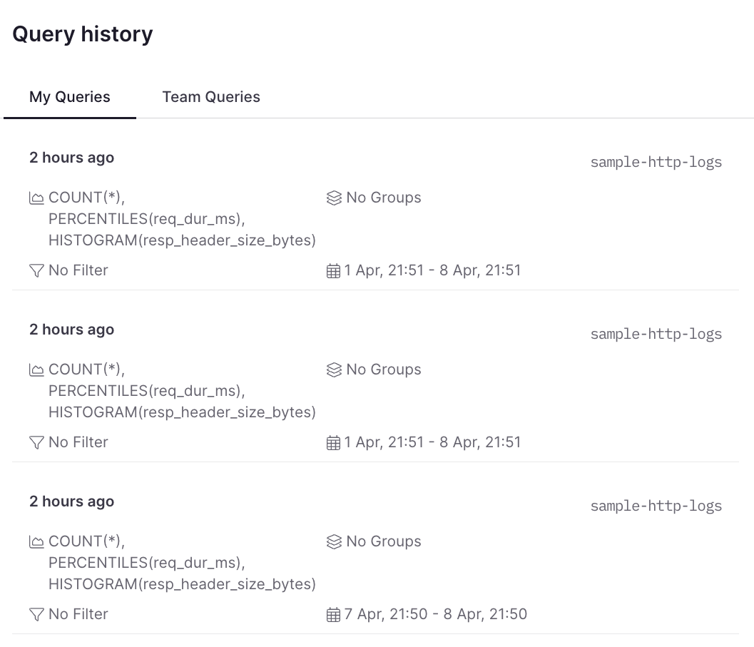
Query history
Every query you and your team members run is given a unique ID and saved inside Axiom. Use the query history to share results with other members or find a past query that you want to star for future use.
Click Query History on the toolbar:
You see historical queries in reverse-chronological order. You can choose between your own queries or those of your team:
Build a query
Use the query builder to create or edit queries for the selected dataset:
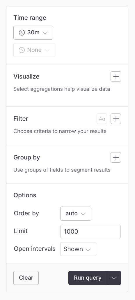
This component is a visual query builder that eases the process of building visualizations and segments of your data.
This guide walks you through the individual sections of the query builder.
Time range
Every query has a start and end time and the time range component allows quick selection of common time ranges as well as the ability to input specific start and end timestamps:
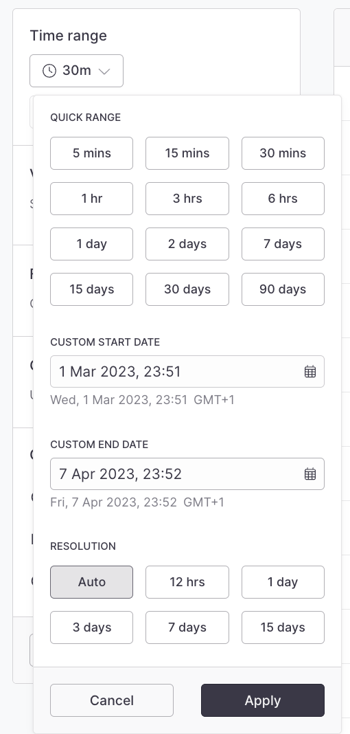
- Use the Quick Range items to quickly select popular ranges
- Use the Custom Start/End Date inputs to select specific times
- Use the Resolution items to choose between various time bucket resolutions
Against
When a time series visualization is selected, such as count, the Against menu is enabled and it's possible to select a historical time to compare the results of your time range too.
For example, to compare the last hour's average response time to the same time yesterday, select 1 hr in the time range menu, and then select -1D from the Against menu:

The results look like this:

The dotted line represents results from the base date, and the totals table includes the comparative totals.
When you add field to the group by clause, the time range against values are attached to each events.

Visualizations
Axiom provides powerful visualizations that display the output of running aggregate functions across your dataset. The Visualization menu allows you to add these visualizations and, where required, input their arguments:

You can select a visualization to add it to the query. If a visualization requires an argument (such as the field and/or other parameters), the menu allows you to select eligible fields and input those arguments. Press Enter to complete the addition:

Click Visualization in the query builder to edit it at any time.
Filters
Use the filter menu to attach filter clauses to your search.
Axiom supports AND/OR operators at the top-level as well as one level deep. This means you can create filters that would read as status == 200 AND (method == get OR method == head) AND (user-agent contains Mozilla or user-agent contains Webkit).
Filters are divided up by the field type they operate on, but some may apply to more than one field type.

List of Filters
String Fields
==!=existsnot-existsstarts-withnot-starts-withends-withnot-ends-withcontainsnot-containsregexpnot-regexp
Number Fields
==!=existsnot-exists>>=<<=
Boolean Fields
==!=existsnot-exists
Array Fields
containsnot-containsexistsnot-exists
Special fields
_time- the timestamp of the event. This is automatically set to system time if it's missing from the event._sysTime- the system time related to when the event was ingested.
_time and _sysTime can be used interchangeably for the majority of cases however, if your events do set a _time explicitly, the _sysTime can be useful to know if events are being ingested in case of clock skews on your event-producing systems.
Group by (segmentation)
When visualizing data, it can be useful to segment data into specific groups to more clearly understand how the data behaves.
The Group By component enables you to add one or more fields to group events by:

Other options
Order
By default, Axiom automatically chooses the best ordering for results. However, you can manually set the desired order through this menu.
Limit
By default, Axiom chooses a reasonable limit for the query that has been passed in. However, you can control that limit manually through this component.
Results view
Query results are presented beside the query builder in the results view:

The results view adapts to the query that has been run and so it adds and removes components as necessary to give you the best experience.
The components that it can present are explained below.
Status bar
The status bar is always visible and gives details on the currently running or last-run query.
Charts
The charts component displays all the visualizations that you have added to the query. Hovering over charts gives extra detail on each result set.
On time series charts, hovering over a specific time shows the same marker on similar charts for easy comparisons.
Totals table
The totals table is the totals from each of the aggregate functions that have run for the visualizations you have requested.
If the query included group-by clauses, there is a row for each group that's part of the results. Hovering over a group row highlights the group's data on time series charts.
Matches
If no visualizations are added to the query, then the matches table lists the raw query results (events).
Dataset view options
The dataset view options are under the settings icon when you run queries on your dataset. With the view options, you can visualize your environment, identify outliers, show raw configuration changes, and detect errors and warnings.
On the View Options, select and deselect the selections you want:
- Wrap lines
- Show timestamp
- Highlight severity
- Show raw

Event timeline
The event timeline in Axiom's Explore tab transforms your query results into a detailed distribution, providing a clear visual representation of events over time. It simplifies identifying trends and patterns while also offering a quick way to gauge total events count across a time range.
To get started with the event timeline, go to the Explore or Datasets tabs.

Run a query on your selected dataset. When your query results are displayed, click the option to show the event timeline.

The timeline shows the distribution of events across the selected time range. Each bar represents the number of events matched within that specific time bucket. Hovering your cursor over a bar reveals a blue line marking the total events and shows when those events occurred in that particular time range.
Click and drag your mouse over the event timeline to focus on the time range. When you do this, the time range for your data automatically updates to match what you selected. And if you change the time range in the Quick Range tab, the histogram updates too.

Benefits
-
Instant visual insights: Quickly understand the distribution of events over time without needing to interpret lines of text or numbers.
-
Effortless number crunching: The distribution does the number work for you, showing total event counts and highlighting spikes, dips, and trends.
-
Tailored data view: Adjust time ranges with ease, ensuring a customized analysis experience.
-
User-friendly interface: Designed with simplicity in mind, no additional learning is required to use this feature.