Create dashboard elements
This section explains how to create dashboard elements.
Dashboard elements are the different visual elements that you can include in your dashboard to display your data and other information. For example, you can track key metrics, logs, and traces, and monitor real-time data flow.
You can create the following dashboard elements:
- Filter bar
- Gauge
- Heatmap
- Log stream
- Monitor list
- Note
- Pie
- Scatter
- Statistic
- Table
- Time series
- Top list
- Spacer
To organize related dashboard elements into collapsible groups, create dashboard sections.
Create dashboard elements
- Create a dashboard or open an existing dashboard.
- Click Edit dashboard.
- Click Add element in the top right corner.
- Choose the dashboard element from the list.
- For charts, select one of the following:
- Click Builder to create your chart using a visual query builder.
- Click APL to create your chart using the Axiom Processing Language (APL). Create a chart in the same way you create a chart in the Editor of the Query tab.
- Optional: Configure chart options.
- Optional: Set a custom time range that’s different from the dashboard’s time range.
- Click Save.
The new element appears in your dashboard. At the bottom, click Save to save your changes to the dashboard.
Create chart using visual query builder
Use the query builder to create or edit queries for the selected dataset:
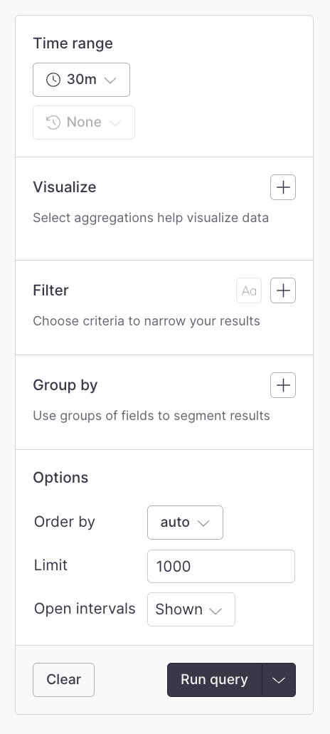
This component is a visual query builder that eases the process of building visualizations and segments of your data.
This guide walks you through the individual sections of the query builder.
Time range
Every query has a start and end time and the time range component allows quick selection of common time ranges as well as the ability to input specific start and end timestamps:
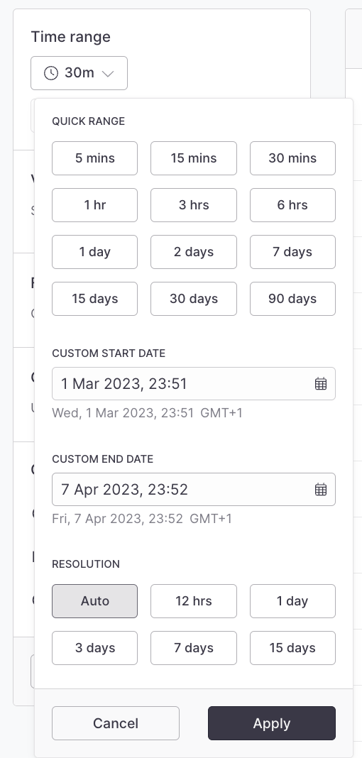
- Use the Quick Range items to quickly select popular ranges
- Use the Custom Start/End Date inputs to select specific times
- Use the Resolution items to choose between various time bucket resolutions
Against
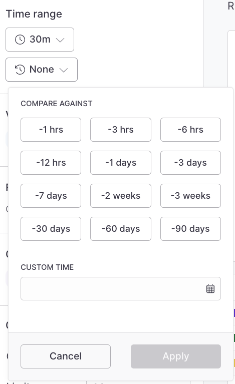
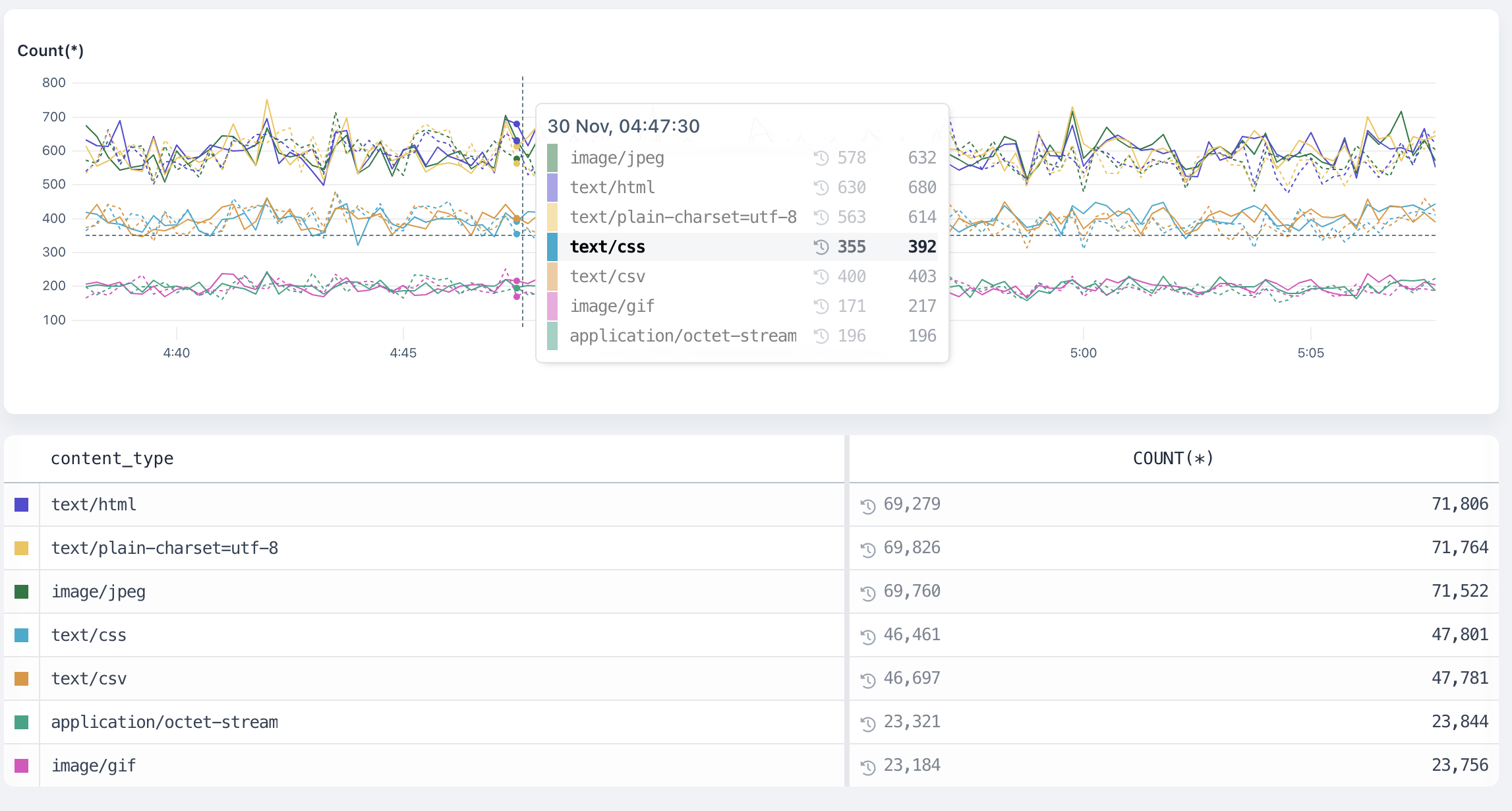
When a time series visualization is selected, such as count, the Against menu is enabled and it’s possible to select a historical time to compare the results of your time range too.
For example, to compare the last hour’s average response time to the same time yesterday, select 1 hr in the time range menu, and then select -1D from the Against menu:
The results look like this:
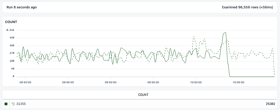
The dotted line represents results from the base date, and the totals table includes the comparative totals.
When you add field to the group by clause, the time range against values are attached to each events.
Visualizations
Axiom provides powerful visualizations that display the output of running aggregate functions across your dataset. The Visualization menu allows you to add these visualizations and, where required, input their arguments:
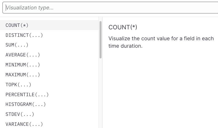
You can select a visualization to add it to the query. If a visualization requires an argument (such as the field and/or other parameters), the menu allows you to select eligible fields and input those arguments. Press Enter to complete the addition.
Click Visualization in the query builder to edit it at any time.
Learn about supported visualizations
Filters
Use the filter menu to attach filter clauses to your search.
Axiom supports AND/OR operators at the top-level as well as one level deep. This means you can create filters that would read as status == 200 AND (method == get OR method == head) AND (user-agent contains Mozilla or user-agent contains Webkit).
Filters are divided up by the field type they operate on, but some may apply to more than one field type.
List of filters
String Fields
==!=existsnot-existsstarts-withnot-starts-withends-withnot-ends-withcontainsnot-containsregexpnot-regexp
Number Fields
==!=existsnot-exists>>=<<=
Boolean Fields
==!=existsnot-exists
Array Fields
containsnot-containsexistsnot-exists
Group by (segmentation)
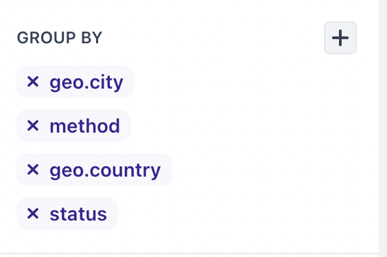
When visualizing data, it can be useful to segment data into specific groups to more clearly understand how the data behaves.
The Group By component enables you to add one or more fields to group events by:
Other options
Order
By default, Axiom automatically chooses the best ordering for results. However, you can manually set the desired order through this menu.
Limit
By default, Axiom chooses a reasonable limit for the query that has been passed in. However, you can control that limit manually through this component.
Change element’s position
To change element’s position on the dashboard, drag the title bar of the chart.
Change element size
To change the size of the element, drag the bottom-right corner.
Set custom time range
You can set a custom time range for individual dashboard elements that’s different from the dashboard’s time range. For example, the dashboard displays data about the last 30 minutes but individual dashboard elements display data for different time ranges. This can be useful for visualizing the same chart or statistic for different time periods, among others.
To set a custom time range for a dashboard element:
- In the top right of the dashboard element, click More > Edit.
- In the top right above the chart, click .
- Click Custom.
- Choose one of the following options:
- Use the Quick range items to quickly select popular time ranges.
- Use the Custom start/end date fields to select specific times.
- Click Save.
Axiom displays the new time range in the top left of the dashboard element.
Set custom time range in APL
To set a custom time range for dashboard elements created with APL, you can use the procedure above or define the time range in the APL query:
- In the top right of the dashboard element, click More > Edit.
- In the APL query, specify the custom time range using the where operator. For example:
APL
- Click Run query to preview the result.
- Click Save.
Axiom displays in the top left of the dashboard element to indicate that its time range is defined in the APL query and might be different from the dashboard’s time range.
Set custom comparison period
You can set a custom comparison time period for individual dashboard elements that’s different from the dashboard’s. For example, the dashboard compares against data from yesterday but individual dashboard elements display data for different comparison periods.
To set a custom comparison period for a dashboard element:
- In the top right of the dashboard element, click More > Edit.
- In the top right above the chart, click Compare period.
- Click Custom.
- Choose one of the following options:
- Use the Quick range items to quickly select popular comparison periods.
- Use the Custom time field to select specific comparison periods.
- Click Save.
Axiom displays the new comparison period in the top left of the dashboard element.