Spotlight
This page explains how to use Spotlight to automatically identify differences between selected events and baseline data.
Spotlight allows you to highlight a region of event data and automatically identify how it deviates from baseline across different fields. Instead of manually crafting queries to investigate anomalies, Spotlight analyzes every field in your data and presents the most significant differences through intelligent visualizations.
Spotlight is particularly useful for:
- Root cause analysis: Quickly identify why certain traces are slower, errors are occurring, or performance is degraded.
- Anomaly investigation: Understand what makes problematic events different from normal baseline behavior.
- Pattern discovery: Spot trends and correlations in your data that might not be immediately obvious.
How Spotlight works
Spotlight compares two sets of events:
- Comparison set: The events you select by highlighting a region on a chart.
- Baseline set: All other events that contributed to the chart.
For each field present in your data, Spotlight calculates the differences between these two sets and ranks them by significance. The most interesting differences are displayed first using visualizations that adapt to your data types.
Use Spotlight
Start Spotlight analysis
- In the Query tab, create a query that produces a heatmap or time series chart.
- On the chart, click and drag to select the region you want to investigate.
- In the selection tooltip, click Run Spotlight.
Spotlight analyzes the selected events and displays the results in a new panel showing the most significant differences across all fields.
Alternatively, start Spotlight from a table view by right-clicking on the value you want to select and choosing Run spotlight.
Interpret results
Spotlight displays results using two types of visualization, depending on your data:
-
Bar charts for categorical fields (strings, booleans)
- Compares the proportion of events that have a given value for selected and baseline events.
- Useful for understanding differences in status codes, service names, or boolean flags.
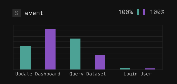
Example barchart
-
Boxplots for numeric fields (integers, floats, timespans) with many distinct values
- Shows the range of values in both comparison and baseline sets.
- Identifies the minimum, P25, P75, and maximum values.
- Useful for understanding differences in response times or other numeric quantities.
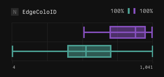
Example boxplot
For each visualization, Axiom displays the proportion of selected and baseline events (where the field is present).
Dig deeper
To dig deeper, iteratively refine your Spotlight analysis or jump to a view of matching events.
- Filter and re-run: Right-click specific values in the results and select Re-run spotlight to filter your data and run Spotlight again with a more focused scope.
- Show events: Rick-click specific values in the results and select Show events to filter your data and see matching events.
Spotlight limitations
- Custom attributes: Currently, custom attributes in OTel spans aren’t included in the Spotlight results. Axiom will soon support custom attributes in Spotlight.
- Complex queries: Spotlight works well for queries with maximum one aggregation step. Complex queries with multiple aggregations aren’t supported.
Example workflows
Investigate slow traces
-
Create a heatmap query:
-
Select the region showing the slowest traces.
-
Run Spotlight to see if slow traces are associated with specific endpoints, regions, or user segments.
Understand error spikes
-
Create a line chart:
-
Select the time period where errors spiked.
-
Run Spotlight to identify if there’s anything different about the selected errors.