
We've believed in one vision since we started Axiom: machine data is worth keeping. All of it. Every log, event, trace, and metric your systems produce has value. Yet the tools that defined the category made keeping it impossible: too expensive at today's volumes, or too much infrastructure to run yourself. That belief finally has a name, the modern machine data platform, and it's what we've been building toward the whole time.
For most of that time, the website told an older story. Until a few months ago, axiom.co opened with "Observability re-invented for high-scale engineering teams." A fine sentence, describing a company about two years behind the one our customers were actually buying from. Customers keep petabytes with us. Enterprises land Axiom beside Splunk and move workloads over. Startups sign up on the free tier and scale without talking to us. The product and the customers moved. The site didn't.
This post is about what we changed, visually and in language, and the reasoning.
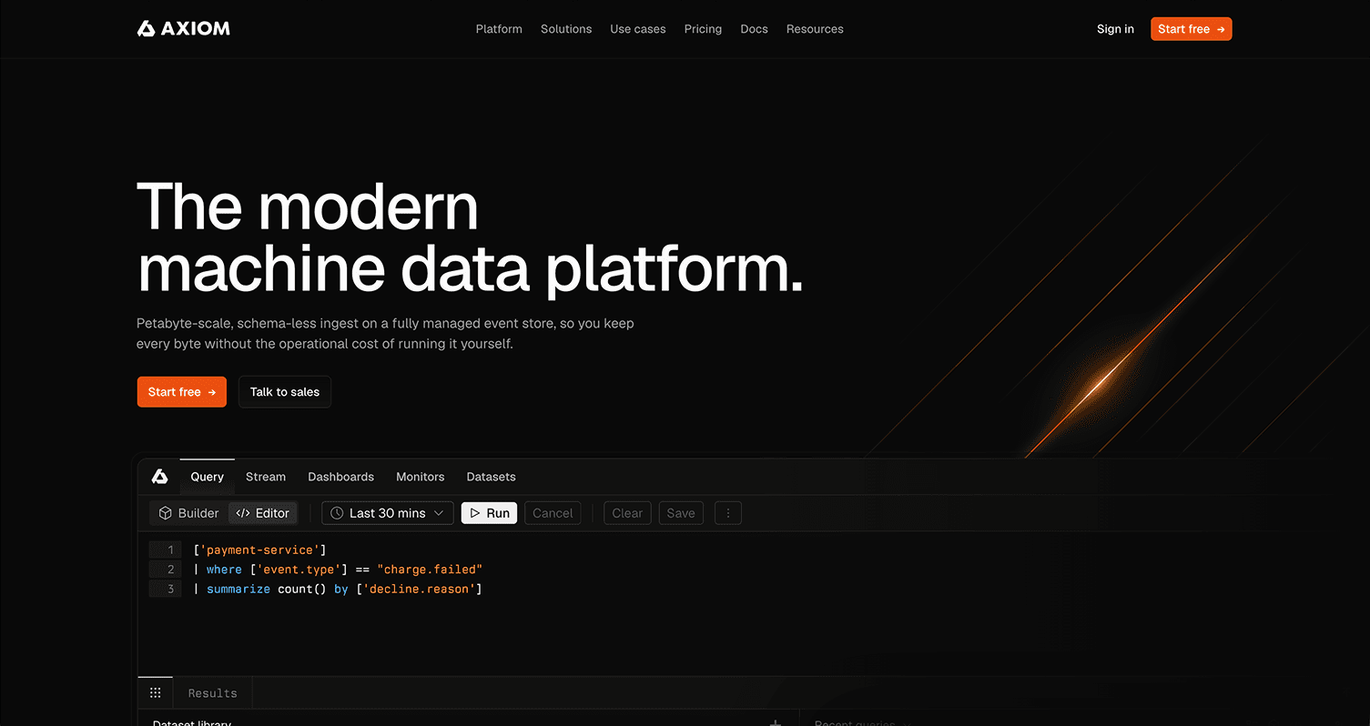 New
New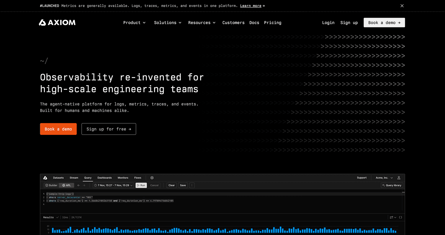 Old
OldWhat changed underneath
We wanted to reorient the Axiom universe around the modern machine data platform focus.
We care strongly about the history of the category and feel that while Splunk pioneered machine data more than twenty years ago (2003), they’ve spent the last decade walking away from it to chase security. Meanwhile, the world has produced more and more machine data, and AI workloads now generate it at volumes the old pricing models were never built for.
The category is worth reclaiming on modern infrastructure, without asking teams to run the cluster themselves. We've been building toward this idea the whole time: an event store purpose-built for machine and event data at scale, petabyte ingest, 95%+ compression, serverless query compute, and APL for the people who query all day. The pieces existed before the category label did. The update’s job was to say out loud what the architecture had been saying quietly.
The promise is the one we make on the homepage now: keep every log, event, trace, and metric at any scale, with pricing you can predict.
The people evaluating Axiom today against that promise sit at two ends of a spectrum.
At one end, engineering leaders at large companies who have hit the wall on legacy tooling. Their problem is a renewal they can't defend and a migration they can't afford to botch, so they need a credible way in that doesn't start with rip-and-replace.
At the other, engineers at high-growth software and AI-native companies who could build their own event-data stack and are pragmatically choosing not to. Their problem is velocity, and they need to be running today with no procurement in the way.
Different entry points, same underlying need: full-fidelity data at a cost that doesn't punish growth. Organizing the site around those two paths is what changed for end users. Evaluating a move off Splunk? There's a migration use case, comparison pages with real numbers, and pricing you can model without a sales call. Kicking the tires? The Playground, the docs, and the free tier are one click from the homepage. Either way, you spend less time inferring whether Axiom is for you, because resources for your situation exists, for free and ungated.
What we wanted the design to say
Three commitments governed the work.
Honest density. A data company's site should show real product, real queries, real numbers. The engineer deciding whether APL fits how they think should be able to tell from the homepage, not from a demo call.
Calm confidence. The restraint of a tool you trust at 3am. The people who rely on these tools are usually mid-incident when they care most. Nothing on the page should be more excited than the reader.
Legible at every altitude. The same system has to work for the engineer scanning a query example and the exec scanning the pricing model, without splitting into an "engineer site" and a "buyer site."
The decisions
Six decisions carried most of the weight. Each one below, with its before and after.
The version we killed first. The cheapest redesign would have been new words in the old design. We mocked it up with the same all-monospace system and ASCII illustrations, with the sharper machine-data copy dropped in and it didn't work. The old design had started focused, then accumulated years of revisions and decoration that muddied the original messaging. The pages still looked like the old company, down to "Book a demo" as the primary button. The updated language was one step toward telling a better product story, but it fell flat within the old design. In the same way we’ve peeled back everything to expose what Axiom really is, we needed to peel back the design and expose the most important parts.
Staking the category claim. The new site opens with "The modern machine data platform." That's our whole focus in five words. Naming the category puts it in the most visible line we have, where customers and competitors can hold us to it. The old headline hedged: "re-invented," "high-scale," words that sound like a category without naming one. If the category is the strategy, the headline should carry it. The page order follows the same logic. Cost and scale lead, because that's the problem most people arrive with. The AI story gets its own section further down: AI-queryable by default, built for engineers and their agents. Agents querying machine data directly is a real shift, and it earned its own space instead being a supporting element of another section.
The product does the talking. The old homepage showed the product below the fold as a video and didn’t highlight the UI again until a few scrolls deeper. The new version puts a working surface near the top and keeps the Playground one click away with no account: real datasets, real APL, run a query and see what schema-less plus pipes feels like. Show the table, not the brochure about the table.
Type and color. The old site set nearly everything in monospace: headlines, body copy, footer. The homepage had a
~/prompt above the H1 and ASCII arrows animating in the background. The instinct made sense. We build a tool for people who live in terminals. But when every word on the page is set in code font, nothing reads as code, and the one thing monospace should signal, "this is what you'll actually type," stops working. Anchoring yourself visually on the page was hard, telling code from prose was harder, and the retro terminal look had started to feel dated. On the new site, prose is set in Inter and Berkeley Mono is reserved to show monospace does in your editor: APL, dataset names, field names, labels, the terminal. We tried other typefaces along the way, but kept the pair the product already uses so the faces didn't change so much as their jobs did. The real product artifacts now stand out instead of blending in. The palette stayed dark with the orange accent.One system, both ends of the spectrum. The primary button changed from "Book a demo" to "Start free," with sales one click away. That's the pricing model expressed as a UI decision: usage-based, permanent free tier, discounts applied automatically in the console, enterprise features as self-serve add-ons, and the ability to run enterprise-scale workloads without mandatory sales calls. For the other end of the spectrum, the site now says plainly what an enterprise evaluation looks like: land beside existing solutions, no rip-and-replace, no renegotiation. Same pages, both readers. The startup engineer hits "Start free" and is querying in minutes; the platform lead at a large company finds the migration path and the pricing math they'll need for the renewal conversation.
What we designed away from. The old site said things like "unlock predictive insights" and "solve today's challenges, shape tomorrow's solutions." None of it false, but none of it checkable, and engineers don't trust what they can't check. The new site names actual failure modes: sampling that grows with traffic, indexing tiers that gate visibility, renegotiation theater, the platform team spending its time keeping the observability pipeline alive. And it names the alternatives with numbers on the pricing section and comparison pages. That carries an obligation: published comparisons have to be kept current, and naming competitors invites them to argue back. We accepted both costs, because we want our users to be able to fairly and honestly evaluate our tooling against their other options without having to go through a long procurement dance.
What we deliberately kept
This was not a rebrand. The mark stayed as is. The dark ground and the orange stayed. The terminal DNA stayed where it earns its place, in the product surfaces and the labels, because that part has always aligned with our brand identity. The free tier stayed as a primary entry point, and the promise didn't move. If you're an existing customer, nothing about the product you use changed because of this work; the website just now does a better job of reflecting it.
The system will keep moving as the product does. A site that carries a category claim has to earn it continuously, and we'd rather adjust in public than batch up another two years of drift. Let us know how it lands: reach out to me at njp@axiom.co. Big thanks to Dominic (product), Gurbinder (design), and Allie (marketing) for all the work on this project.
The short version of all of it: the product became the modern machine data platform some time ago. Now the website has caught up with the customers who got there first.