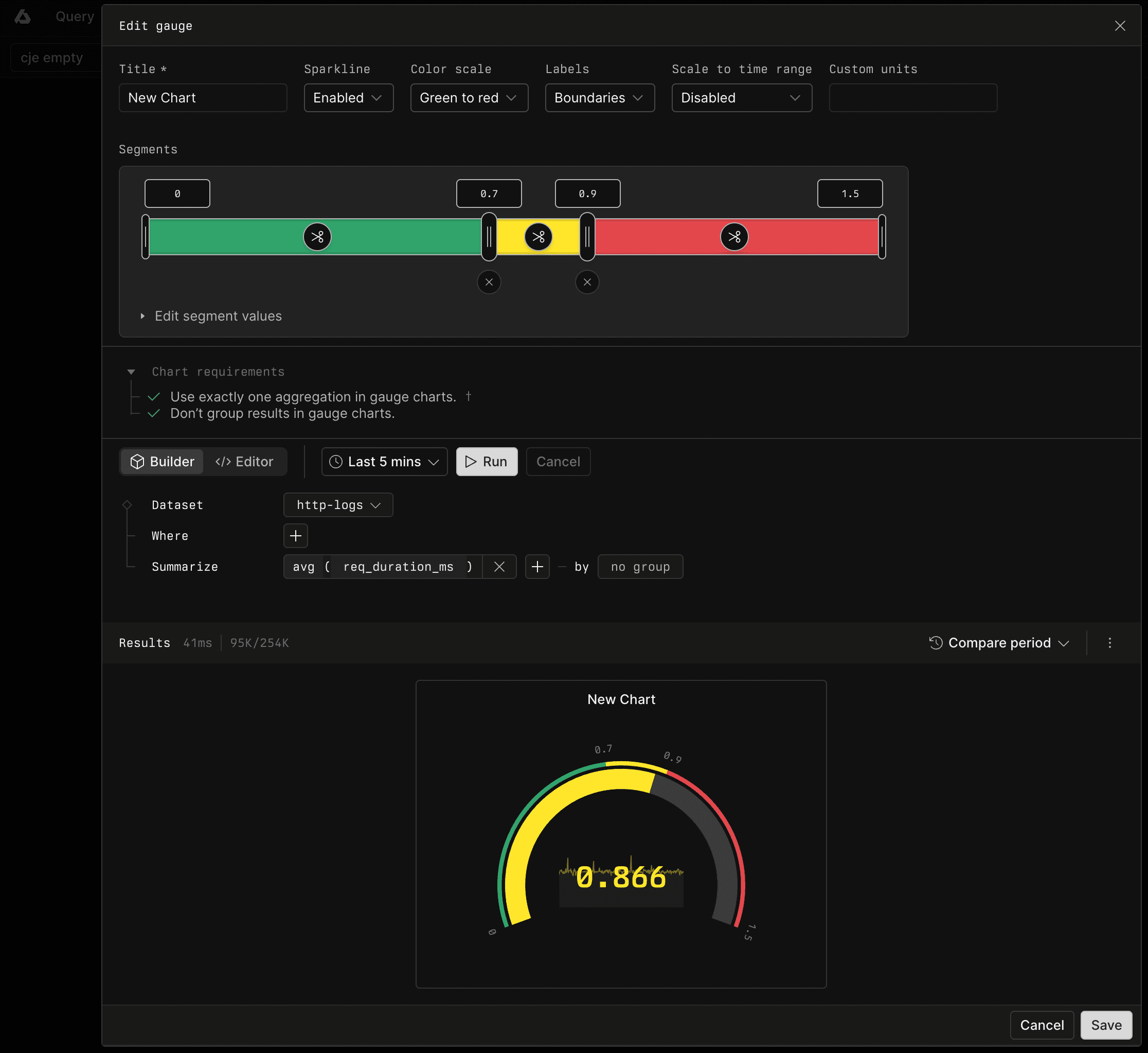
Gauge dashboard elements are now available in Axiom.
Gauges compare a single numeric value with color-coded segments. Use them to show whether a current value, such as request latency or an error count, is within an expected range.
Set ranges directly
Enter exact boundary values above the segment rail, or drag the boundary handles. Split a segment with the scissors control. Merge adjacent segments with the remove control below their shared boundary.
For a row-based view, expand Edit segment values. Enter the From and To values for each segment, or use Split segment and Remove. The editor keeps segments ordered and contiguous.
Configure the display
Choose a color scale from green to red or from red to green. Display evenly spaced interval labels, exact segment boundaries, or no labels. Add custom units to the value, and enable the sparkline to show how the value changed over time.
Scale thresholds with time
For count and sum gauges, changing the dashboard time range also changes the expected total. Enable Scale to time range to adjust the segment boundaries in proportion to the selected time range. Leave it disabled to use absolute segment values.
Create gauges with Builder or APL
Gauge queries return one numeric series. In Builder, use one aggregation and leave Group by empty. In APL, use a summarize or count statement and group only by _time when displaying a sparkline.
For more information, see Gauge.