Gauge
This section explains how to create gauge dashboard elements and add them to your dashboard.
Gauge dashboard elements compare a single numeric value with colored segments. Use a gauge to show whether a current value, such as an error count or average response time, is within an expected range.
Prerequisites
- Create an Axiom account.
- Create a dataset in Axiom where you send your data.
- Send data to your Axiom dataset.
- Create an empty dashboard.
Create a dashboard element
- Go to the Dashboards tab and open the dashboard to which you want to add the gauge.
- Click Edit dashboard.
- Click Add element in the top right corner.
- Click Gauge from the list.
- Choose one of the following:
- Click Builder to create your chart using a visual query builder. For more information, see Create chart using visual query builder.
- Click APL to create your chart using the Axiom Processing Language (APL). Create a chart in the same way you create a chart in the Editor of the Query tab.
- Optional: Configure the dashboard element.
- Click Save.
The new element appears in your dashboard. At the bottom, click Save to save your changes to the dashboard.
Configure gauge segments
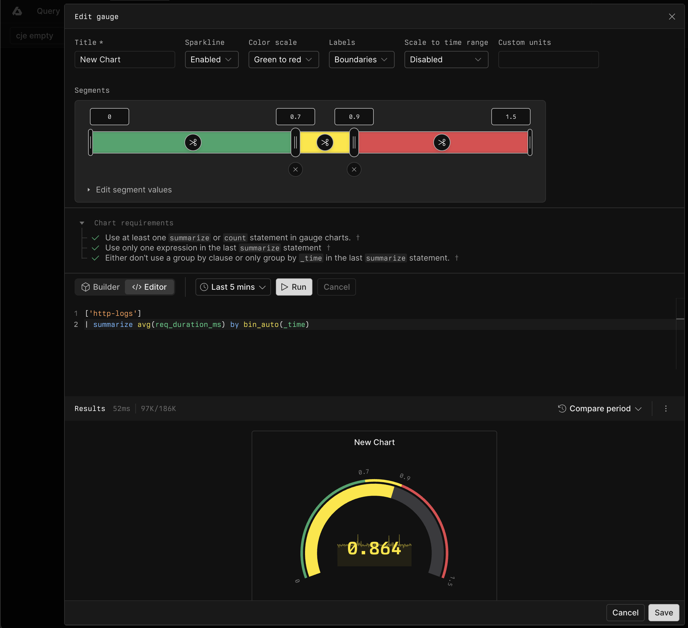
Use the segment rail to configure the ranges:
- Enter exact boundary values in the inputs above the rail, or drag a boundary handle.
- Click the scissors control inside a segment to split that segment.
- Click the remove control below a shared boundary to merge the adjacent segments.
For a row-based view, expand Edit segment values. Enter the From and To values for each segment, or use Split segment and Remove. Each segment starts where the previous segment ends.
The selected color scale assigns a color to each segment.
Configure gauge display
Configure the gauge with the following options:
- Sparkline: Display the value over time inside the gauge.
- Color scale: Apply colors from green to red or from red to green.
- Labels: Display evenly spaced Intervals, segment Boundaries, or no labels. Intervals is the default.
- Scale to time range: Scale segment values in proportion to changes in the dashboard time range. Enable this option for count and sum thresholds that represent the chart's saved time range.
- Custom units: Display a unit after the gauge value.
Query requirements
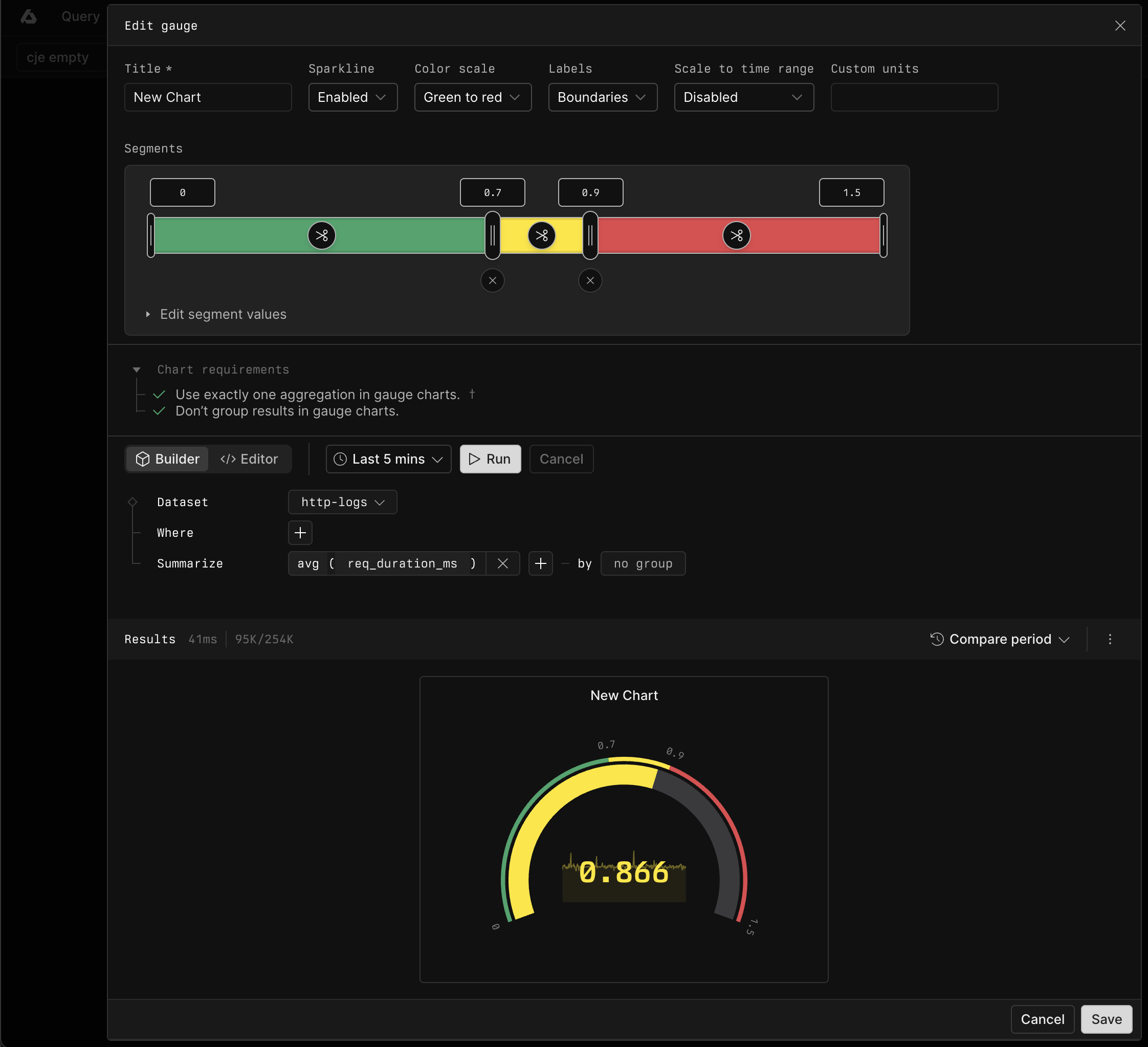
Gauge queries return one numeric series. In Builder, add exactly one aggregation and leave Group by empty. In APL, use a summarize or count statement. If the query contains summarize, return one expression from the last summarize statement and group only by _time, if at all.
Example with Builder
In Builder, summarize req_duration_ms with the avg aggregation.
Example with APL