
Axiom’s log analytics allow you to get deep visual representations of your events which can be crucial for monitoring your apps and services. By adding log analytics to your devops tool chest, you will be able to get a more comprehensive overview of your data and how it changes over time.
In this guide, I will show you how to create and read the charts and tables you can quickly and easily derive from your data in Axiom.
Prerequisites
- Axiom Dataset with ingested events
- Axiom Token
- Access to an Axiom deployment
Let’s get going ⚡️
-
Before you can analyze and visualize your events on Axiom, you need to ingest your events into your dataset on Axiom. This will let you run different aggregations and extract statistics from your data.
-
To ingest events on Axiom, you need to create a new dataset and an ingest token. You can ingest events into Axiom using the Ingest API, any of our Data shippers, or using the Elasticsearch Bulk API that Axiom supports natively.
-
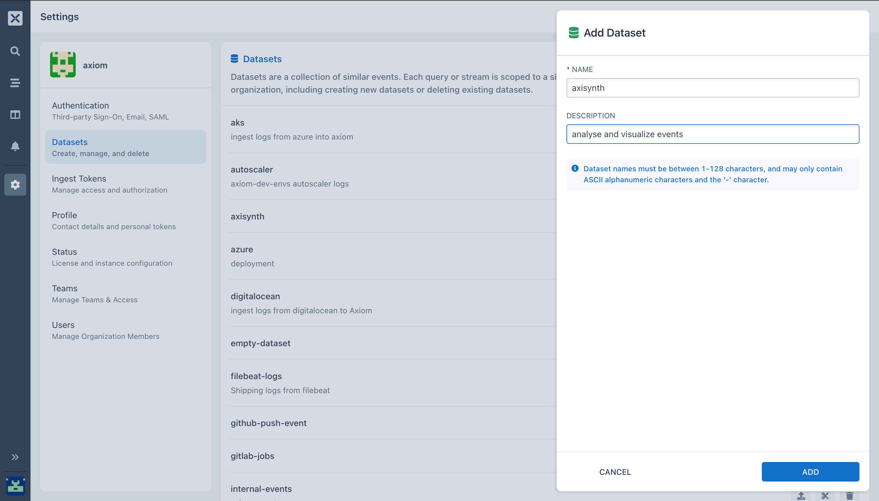
To create a new dataset, go to Settings → Datasets on the Axiom UI.
- Enter the Name and Description of your dataset. Datasets are a collection of similar events When data is sent to Axiom it is stored in a dataset.
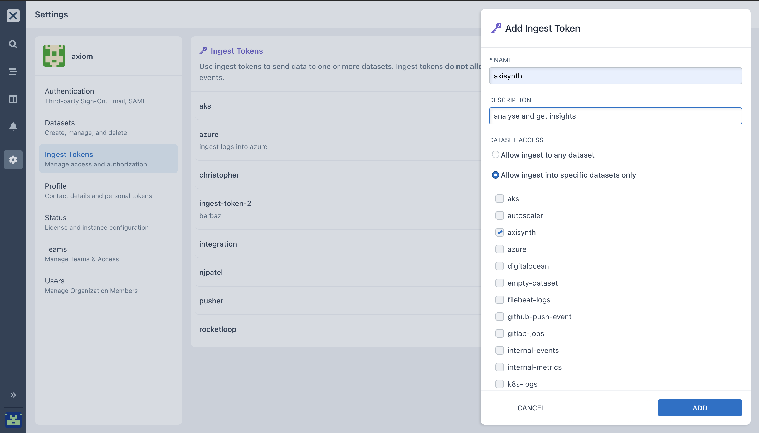
- Generate your ingest token, this will let you send data to one or more datasets which the token is configured for.
- In the Axiom UI, click on settings, select ingest token.
- Select Add ingest token.
- Enter a name and description and select ADD.
- Copy the generated token to your clipboard. Once you navigate from the page, the token can be seen again by selecting Ingest Tokens.
-
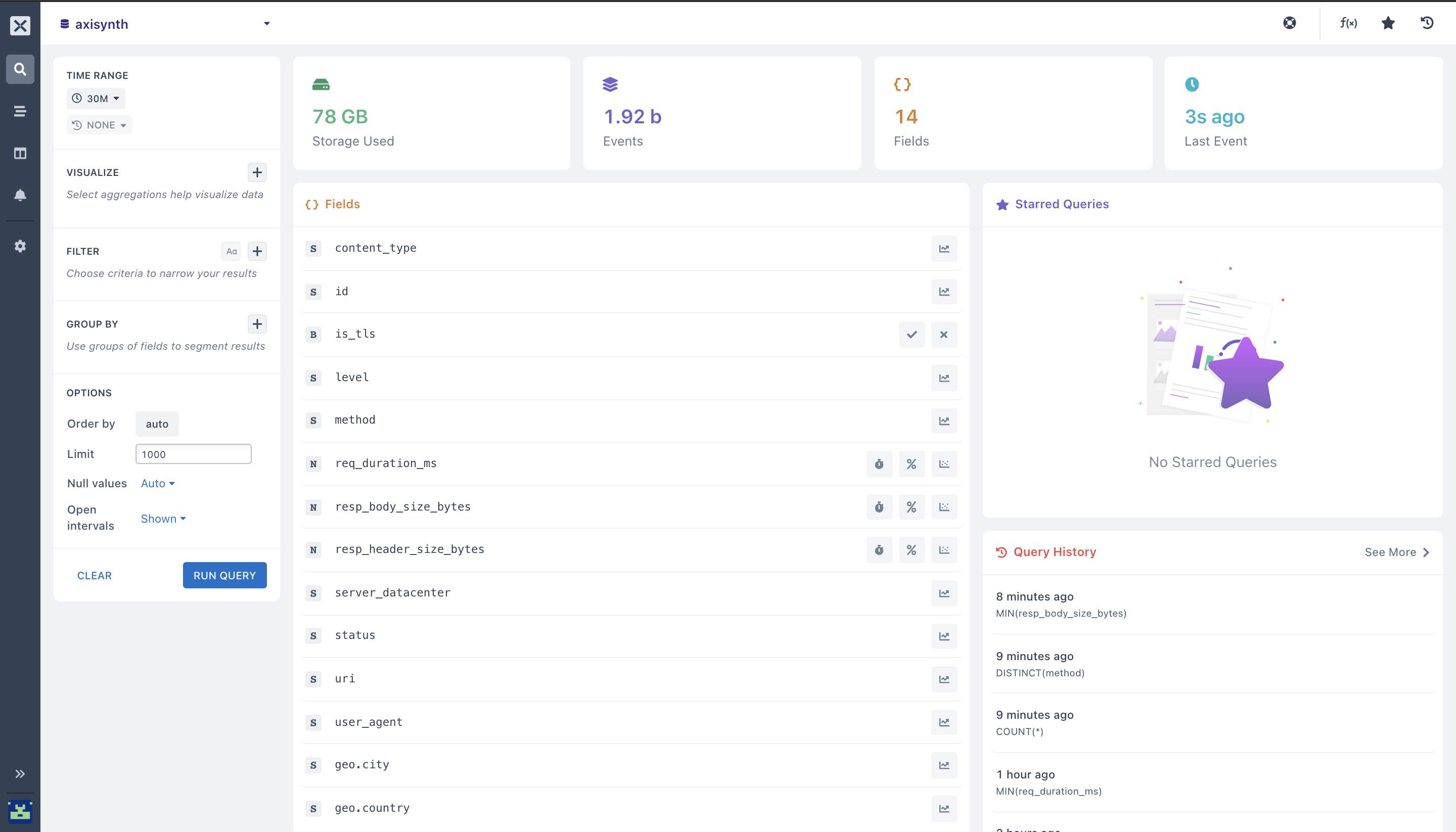
Here, I have ingested the events into the
axisynthdataset that I created in step 1. In this dataset, we are going to analyze, extract and get different comprehensive visualizations using different aggregations in the Axiom UI. -
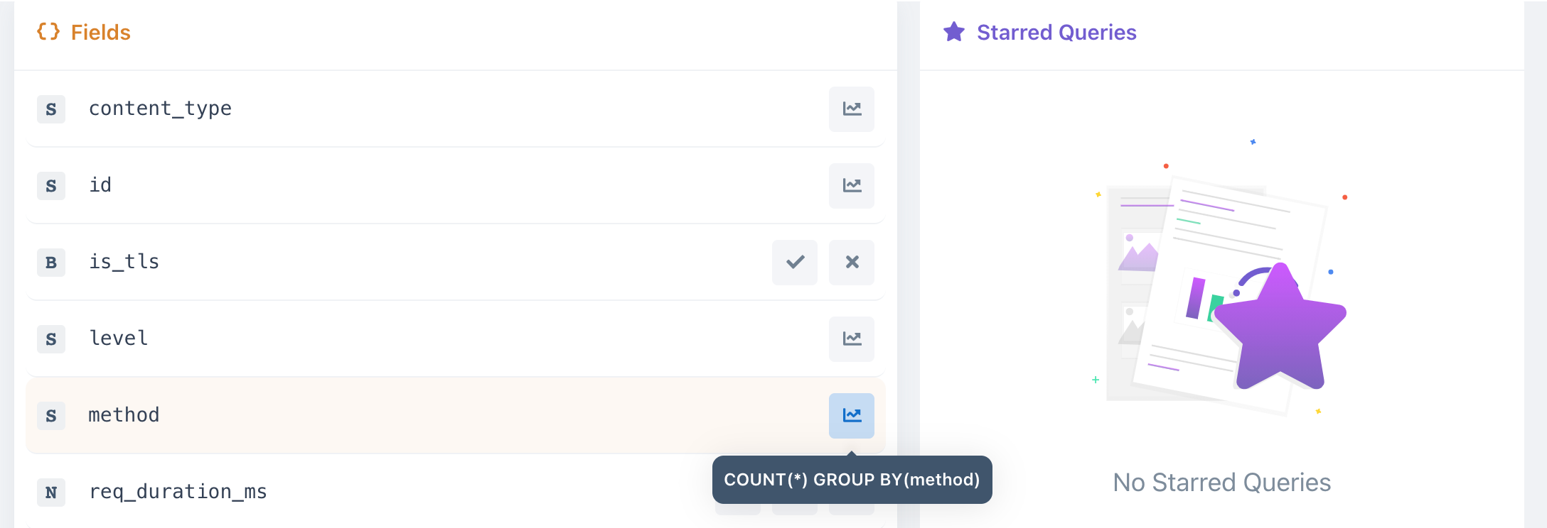
In the Axiom dashboard, select your dataset where you ingested logs to. You will see an overview of all the different
{} Fieldsin your dataset.
- Select the field you want to aggregate by clicking on the (+) button next to VISUALIZE
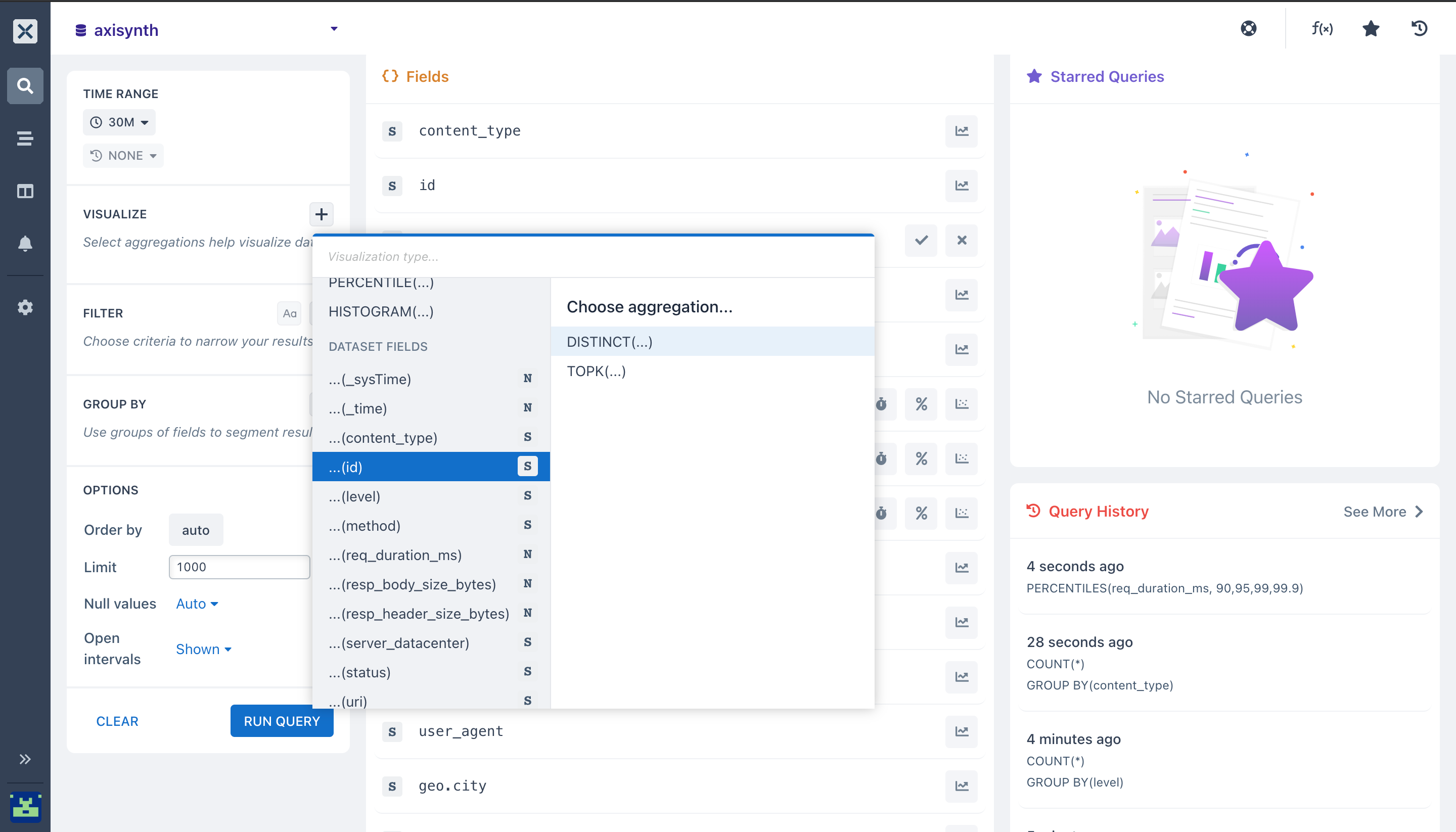
- or you can select the symbols attached to each
{ } Fieldsthis will let youGroupand segment the results of the field(s) you selected.
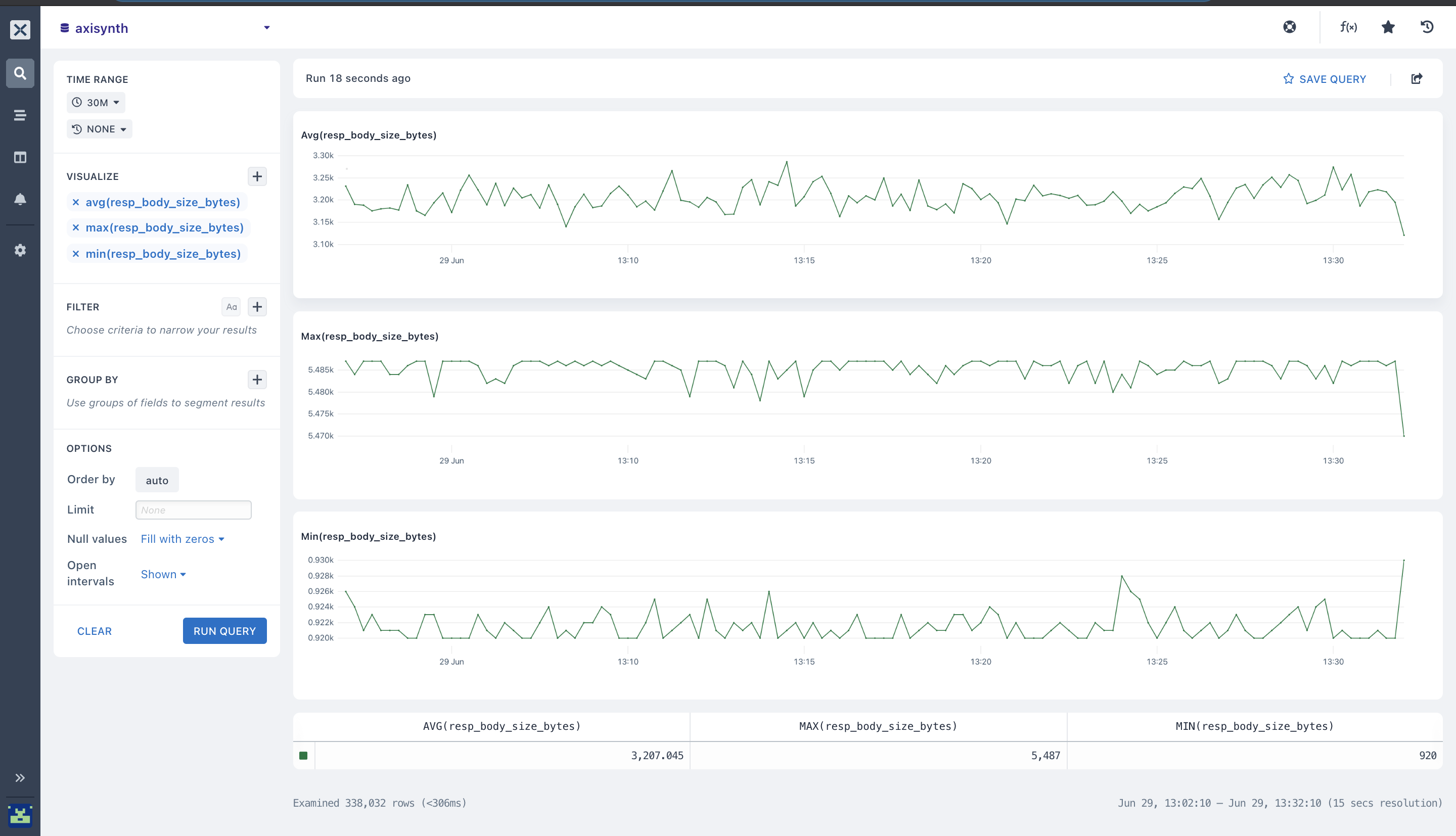
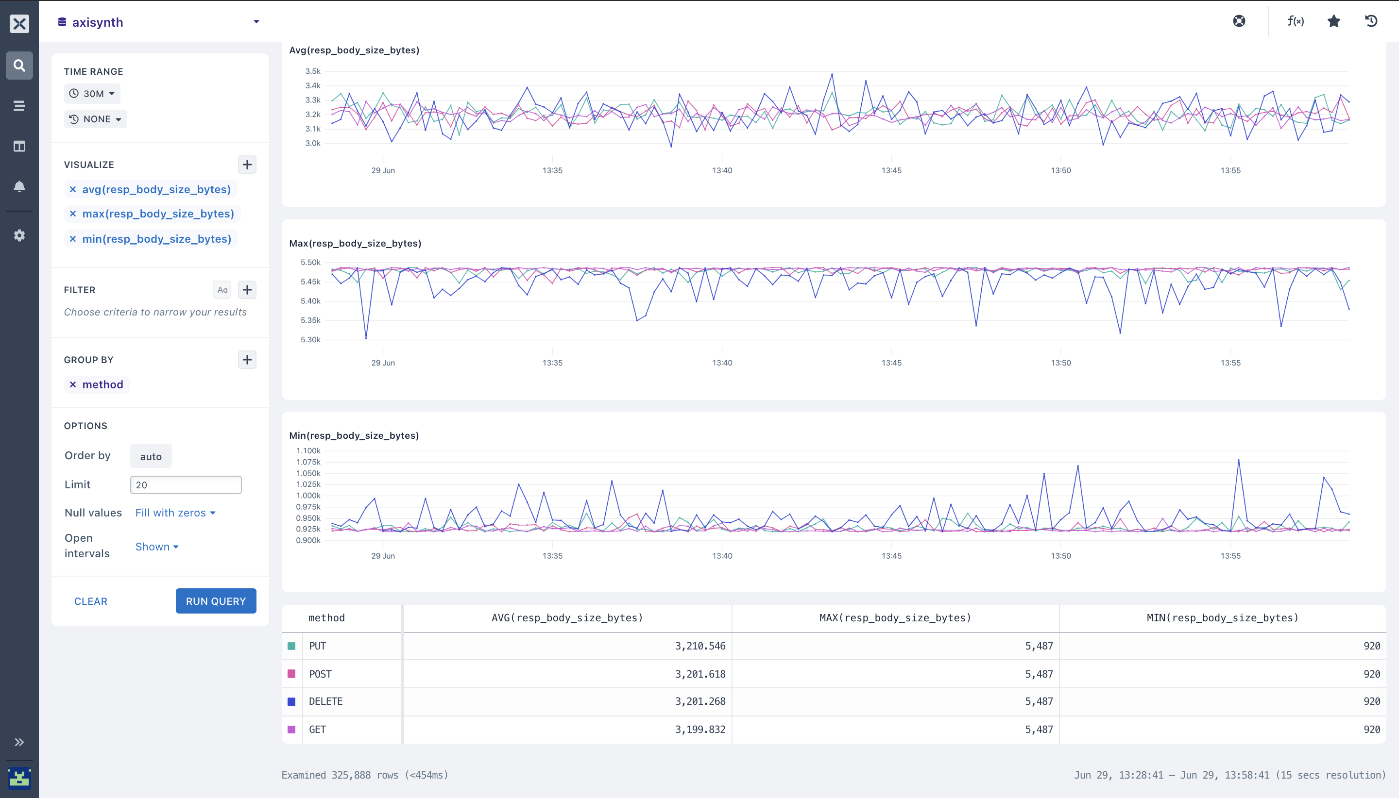
- In the axisynth dataset, you can run aggregations across the dataset to get maximum insights and visibility into your events. For example, you can get the
Avg(resp_body_size_bytes),Max(resp_body_size_bytes)and theMin(resp_body_size_bytes)from the(resp_body_size_bytes)field in your dataset.
Where:
Avg = Average; The average() type lets you calculate the mean value for your resp_body_size_bytes field in each time duration on your axisynth dataset.
Min = Minimum; With the minimum() aggregation you can get the lowest value for the resp_body_size_bytes field from your axisynth dataset. When you have selected your field and you run the min() aggregation, it outputs a chart that contains the minimum value for each time duration in the table below the chart.
Max = Maximum; maximum aggregation outputs a graph that comprises the topmost value for every time interval in the resp_body_size_bytes field we selected together with the complete maximum value all through the different time periods in the table list below the graph.
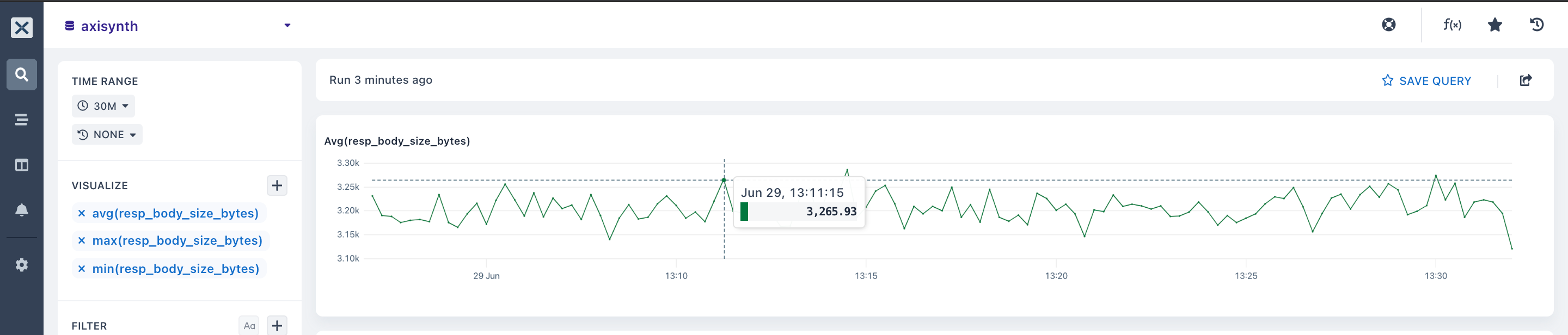
- From the first graph, you can get the specific
meanvalue for a given time. Here, you can see the output of theaveragestatistic of3465.93 byteson the29th of junearound13:11:15 PM.
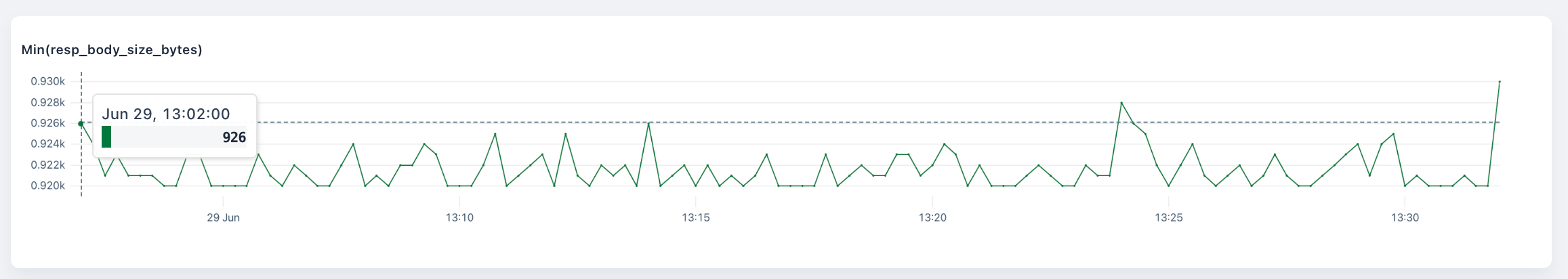
- Similar to the Min chart, you can see the lowest value is
926 bytes onJune 29thin the time of13:02:00 PM.
Reading and getting the different visualizations and values from the chart will help you and your team know at what particular time and date did an event occur.
- You can segment your dataset field
resp_body_size_bytesusing theGroup by clause, this will let you see an observable view by pairing your aggregations(avg, min and max)we selected in step 7 with the Group by expression in the Axiom UI. With this you can segment your data, and get an analysis of how each fraction of your dataset field is operating.
With this, your organization can create and obtain data stats, group fields, and monitor methods in running deployments.
- In the charts below, you can stage, section, or group your data by the
method fieldso you can see how differenthttp methodsare performing.
From the chart below, you can see the Avg(resp_body_size_bytes), Max(resp_body_size_bytes), and Min(resp_body_size_bytes) of the method field.
Where:
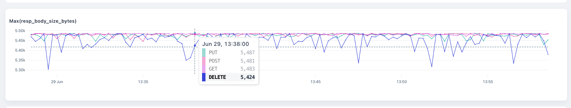
- PUT is illustrated with colour green on the chart and table.
- POST is illustrated with the red colour on the chart and the table.
- DELETE is illustrated with the blue colour on the table and graph.
- GET is illustrated with the purple colour on the graph and table.
Going further, you may want to directly get the specific values of each method from the graph. Here it gives you the output of each method on the 29th of June around 13:38:00 PM
- PUT method from the chart has a maximum value of
5,487 bytes - POST method has a maximum value of
5,481 bytes - GET method has a maximum value of
5,483 bytes - DELETE method has a maximum value of
5,424 bytes
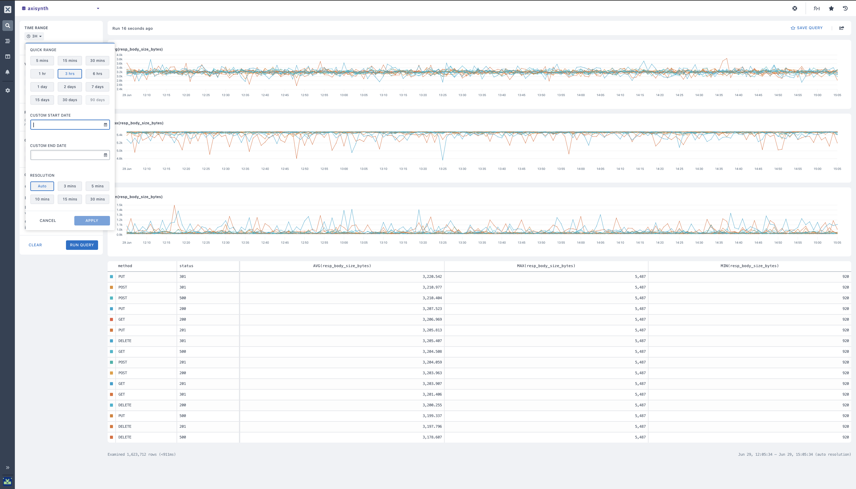
- You can add more fields to the
Group By clause and adjust the time rangeto get the range from different time intervals, with this you will see the average response body size, maximum response body size, and status from the time period of an hour ago, or a day, and also a week or a month. By using theAgainst query option,your query will be charted against data from a preceding point in time so you can easily detect variations, etc.
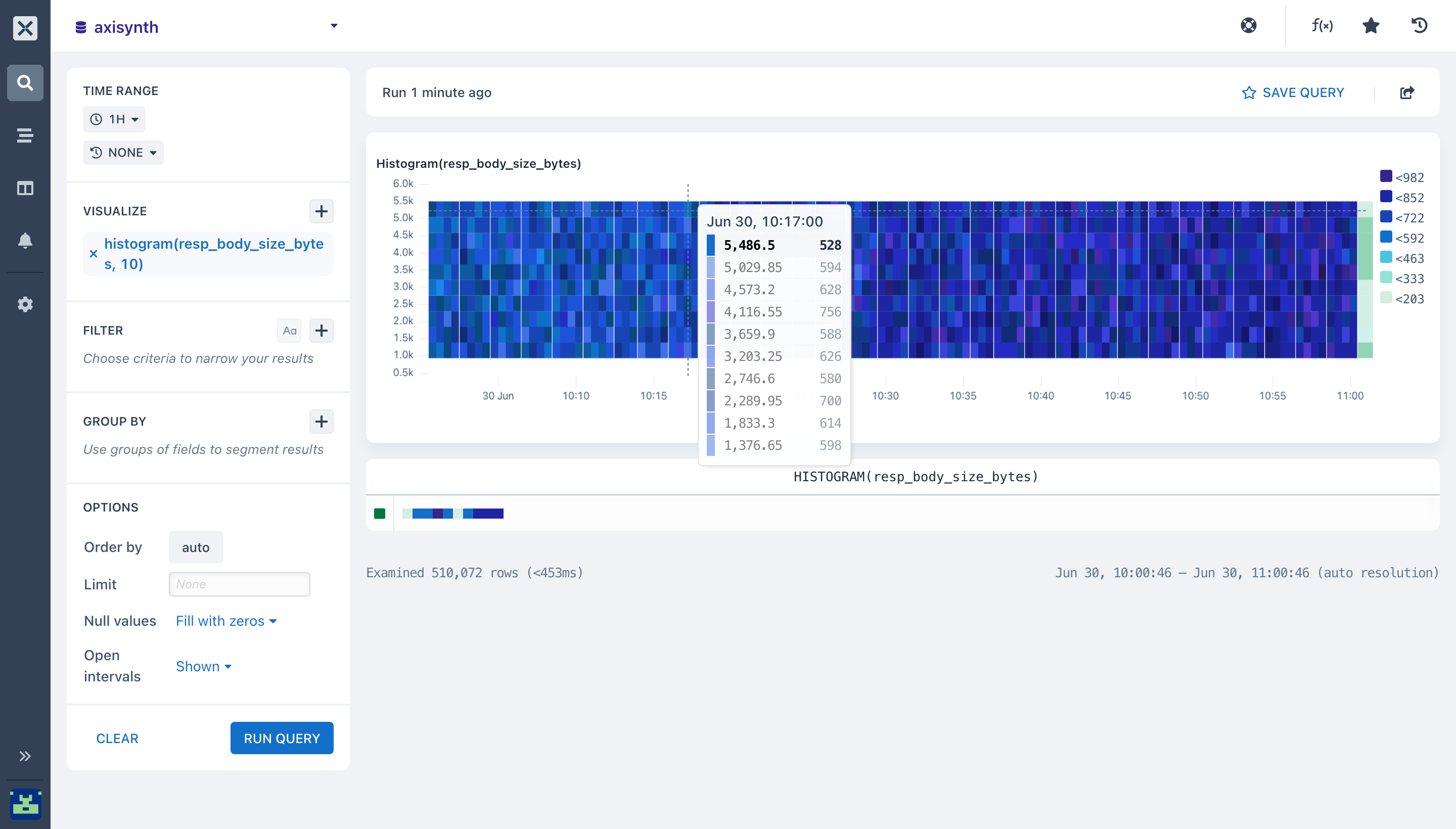
- You can identify if a value distribution in your
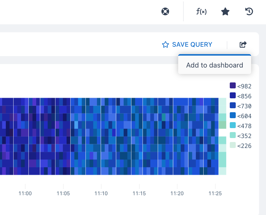
(resp_body_size_bytes)is above or beneath a certain threshold using thehistogram aggregationThe histogram aggregation produces aheatmapvisualization that makes it easy to see faults as well as general distribution of your data from(resp_body_size_bytes)
In this heatmap below, you can see the number of buckets specified which is 10, this splits the distribution values in the (y-axis). If you want to get the error that happened on June 30th around 10:17:00 hrs go to the heatmap and trace the time path it show you the setbacks that occurred and each setback is represented with a specific colour on the heatmap.
- For the bucket value that occurred at numeral
10the heatmap distribution value is528from the chart.
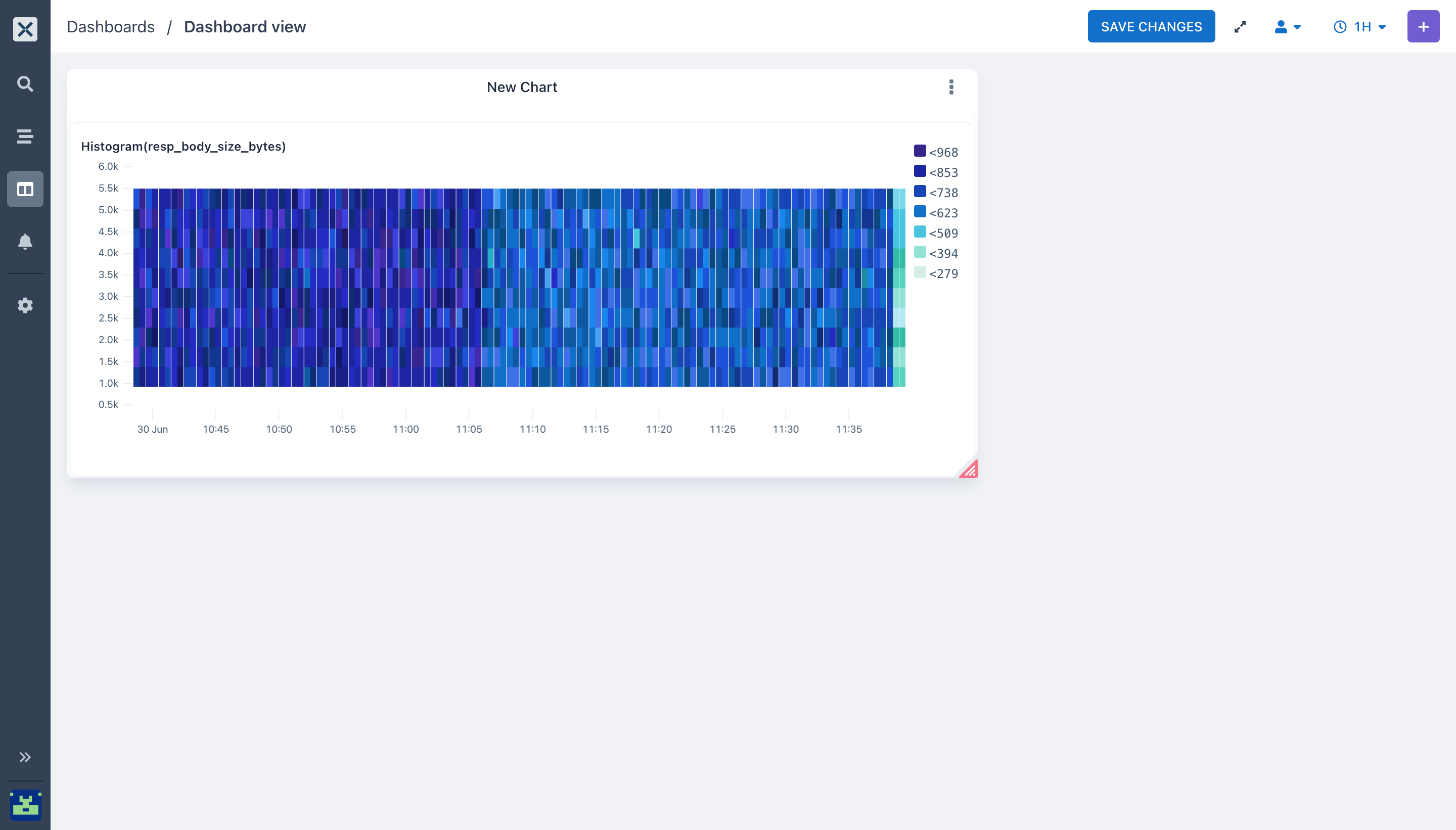
- You can visualize and group your heatmap in one place to get an overview and also Share an overview of your request performance or usage to other members of your team using Axiom Dashboard. To do that click on the dashboard icon this adds your visualization to your dashboard.
- Select the dashboard name you want and add your visualization to it
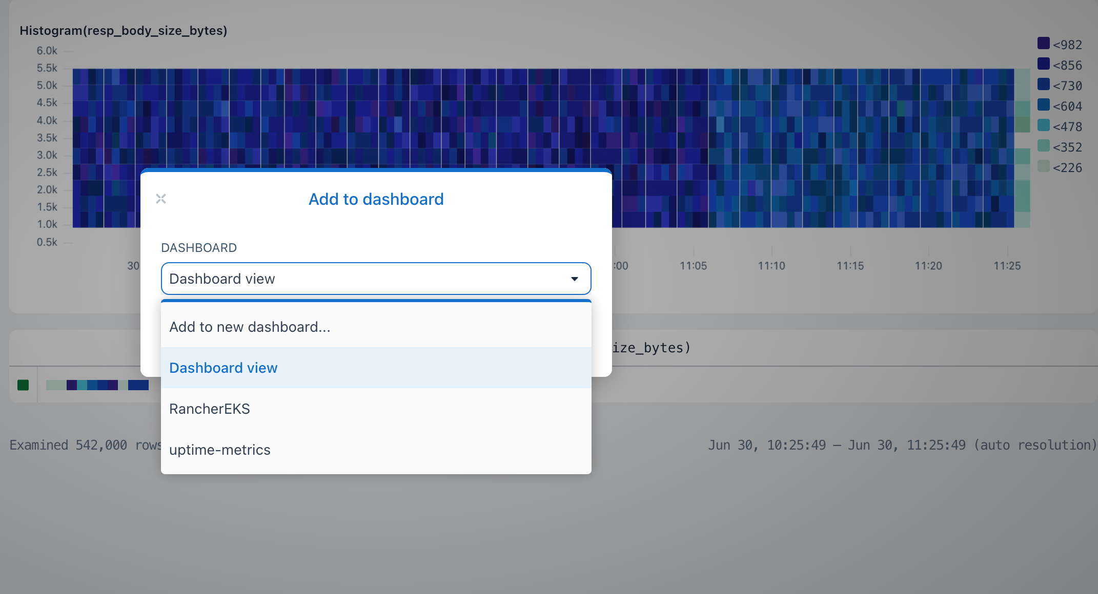
- Go back to your dashboard, you will see the visualization you added. Dashboard will be very helpful to your team members because it will be a shared workspace to build, test queries and get a full-scale view when errors occur with all team members.
It’s just that easy! 🙌
If you have specific questions or issues configuring the file, I'd love to hear about them. Contact us here or ask a question in our Discord community!
You can also follow us on Twitter and on our blog. And if you’ve enjoyed this post, please, take a second to share it on Twitter.
Next Steps
- To get started with Aggregations on Axiom, be sure to check out the Getting Started Guide.
- Check out our docs to know more about Visualizations
- Shipping uptime metrics to Axiom
- Working with Axiom API
Stay tuned for our next blog post 😇


