
In this article, I will show you how to use Aggregations with queries on Axiom.
What are Aggregations?
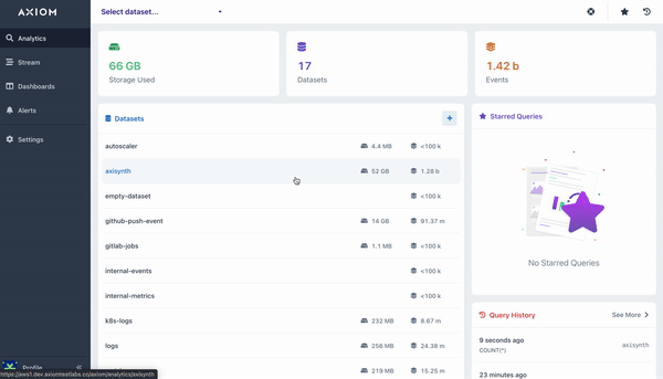
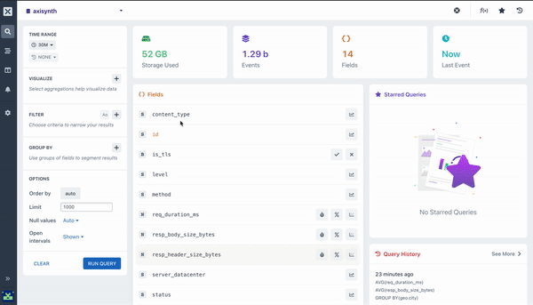
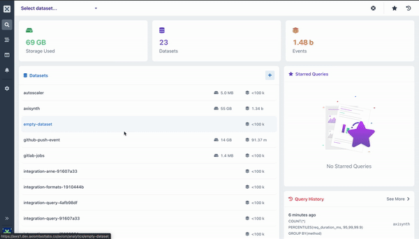
Aggregations a way of grouping and extracting statistics/insights from your data. They run on data you have ingested into Axiom, such as events from log files, events, metrics, or any other form of JSON, ND-JSON, and CSV data.
An Aggregation is essentially a function that is run across all the matching data after filtering. That means some aggregations can require arguments to correctly function, such as max($fieldName).
All queries with aggregations produce a visualization as well as a table of results. Visualizations help to understand the data more easily.
Let’s dive into some of the aggregations Axiom supports:
count()
The count aggregation will count all matching events in a dataset, bucketed by a time duration. A line chart is then rendered with the returned data that shows the number of events in each time bucket. This aggregation does not require any arguments.
sum()
The Sum aggregation calculates the total value for a field across the query time range. A chart is rendered that shows the sum in each bucket of time, and the overall total is available in the table beneath the chart. The example below calculates the total value for the specified field given.
distinct ()
The Distinct aggregation calculates the number of unique values for a field in each time duration. To use this aggregation, you can specify the distinct($fieldName) function to get the chart for the values in the field you selected.
The chart that is produced shows the number of distinct values for each bucket of time, and the table beneath the chart shows the total number distinct values for the entire time period selected.
average ()
Calculate the mean value for a numeric field in each time duration. The overall average across the entire time period of the query is available in the table beneath the chart.
minimum ()
Calculate the minimum value for a numeric field using this aggregation. This aggregation outputs a chart that contains the minimum value for each time duration, as well as the overall minimum value across the time period in the table beneath the chart.
topk()
The TopK aggregation is an estimated aggregation perfect for use when you want to know the “top 5” or “top 10” (where ‘5’ and ’10’ are ‘k’ in the topk) values for a field in a dataset. For example, which are the top 10 countries that we get http requests from? Who are the top 5 contributors to our open source repo? etc
The topK aggregation takes two arguments:
-
The field to aggregate
-
How many results to return (top 5 or top 10 or top 20, etc)
By using TopK instead of a count(*) + groupby(myField) you can increase the performance of your query with very little cost around accuracy.
histogram ()
The Histogram aggregation shows the distribution of values in a field across the time range of the query. The aggregation produces a ‘heatmap’ visualization that makes it easy to see anomalies as well as general distribution of the data.
The Histogram aggregation takes two arguments:
-
The field to aggregate
-
The number of buckets to split the values into (y-axis)
percentile ()
The Percentile aggregation allows you to calculate the value of a field at or below which the percent of the results in the field fall. It is possible to send multiple percentiles to easily visualize the distribution of the values.
By default, adding a percentile aggregation will fill out the 95, 99, and 99.9 percentiles (also written as P95, P99, and P999). You can adjust these as required.
Pairing Aggregations with Group By
Many of the aggregations above can be paired with a Group By clause in your query to segment your data. For example, while it can be useful to see the average response time across all HTTP requests made to your web service, it is much more useful to segment or group that data by the method field so you can see how different kinds of requests are performing. Going further still, you may want to include the path too so you can see how different endpoints are performing.
Pairing Aggregations with Against
Ever wanted to know if what you’re seeing for the average response time or number of requests is similar or not to the same time period an hour ago, or a day, what about a week or a month? By using the Against query option, your query will be charted against data from a previous point in time so you can easily detect anomalies, etc.
Congrats! 🎉
You have seen how amazing it is to build queries using different aggregations on Axiom. We can’t wait to see what you do with each of them.
And don’t forget to check our documentation to learn more about Axiom
Happy Querying!!!


