
In today’s data-driven era, clarity and insight into your infrastructure can make all the difference between seamless operations and unforeseen challenges. Observability and logging are cornerstones in ensuring this clarity. Recognized for delivering comprehensive solutions for your logging, metrics, and traces, Axiom has raised the bar again. We are thrilled to introduce new chart types, enhancing your visualization and analysis experience within Axiom.
The Potential of the New Chart Types
The recent changes include three new chart types: Filter Bar, Log Stream, and Scatter chart. Each offers a unique approach to visualizing data and provides users a distinct way to monitor and observe data.
Filter Bar Chart
The Filter Bar chart type is designed for context-specific filtering within dashboards, allowing users to create filters based on existing data dynamically. Using attributes such as filter type, filter name, and filter ID, users can tailor their filters precisely, ensuring that the charts configured with APL respond directly to these criteria.
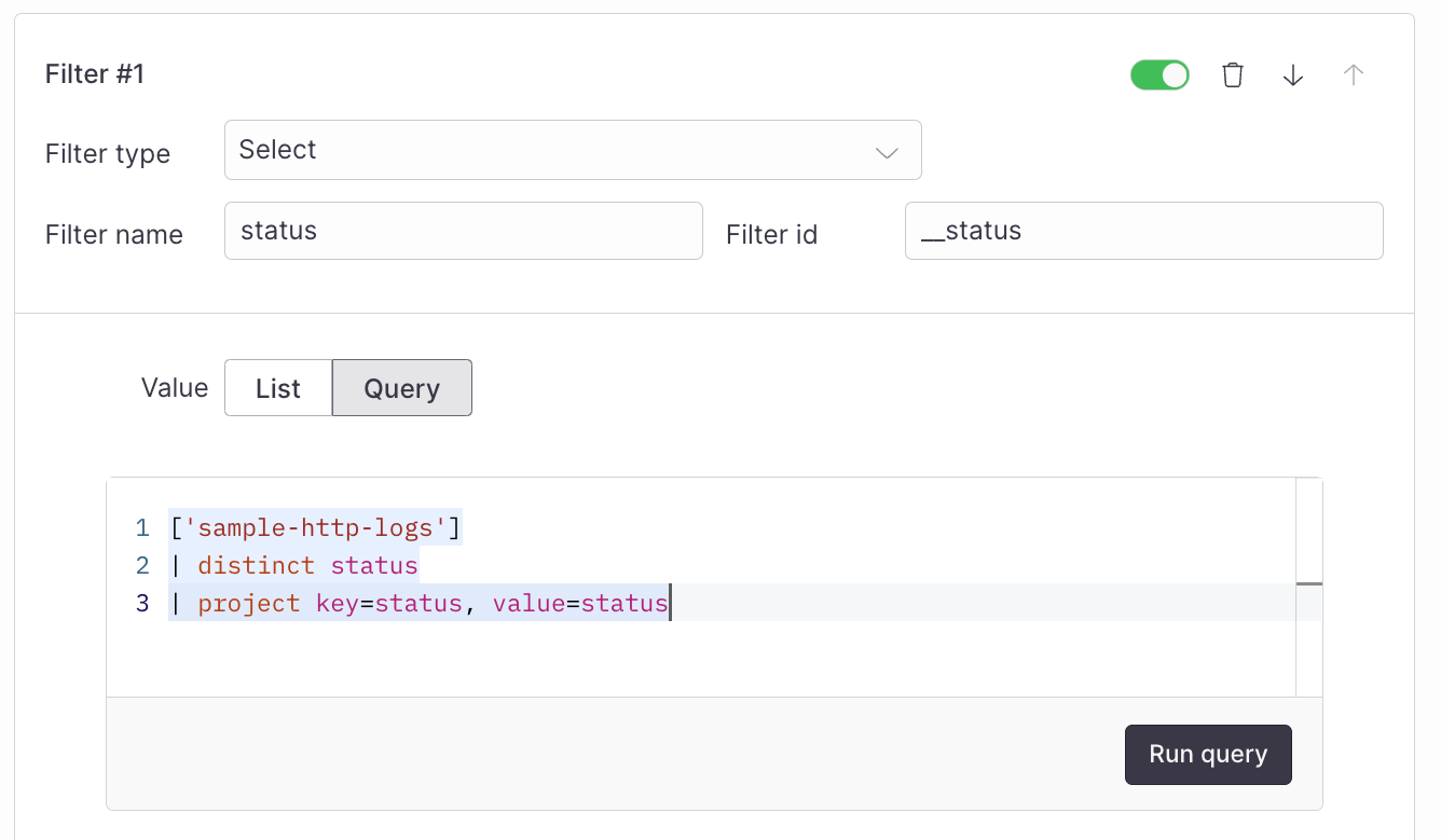
Filter Bar filers dictate dashboard displays, managed via a specific dataschema defining data structure. For instance, dashboards can utilize a filter_id of string type.
dataschema filter_id: string;
['<dataset-name>']
| where <your-field> == filter_id
Using the Filter Bar chart type, you can sift through logs for specific error messages, monitor metrics like service response times within selected timeframes, and improve observability by refining traces based on user or service attributes
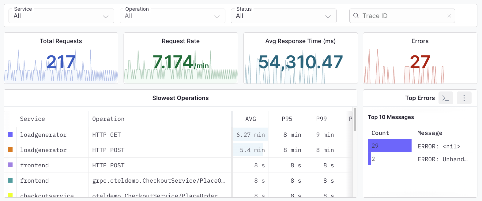
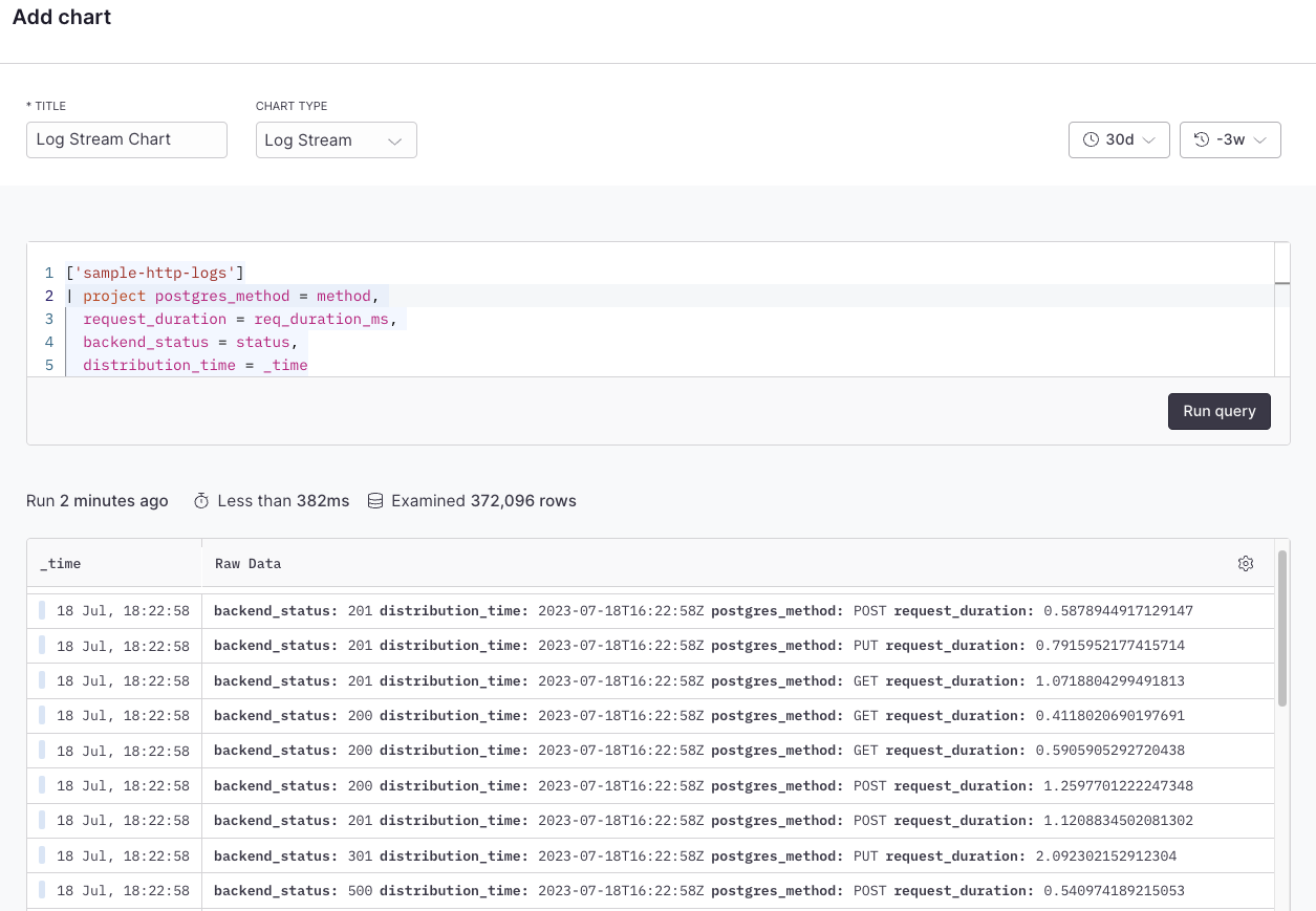
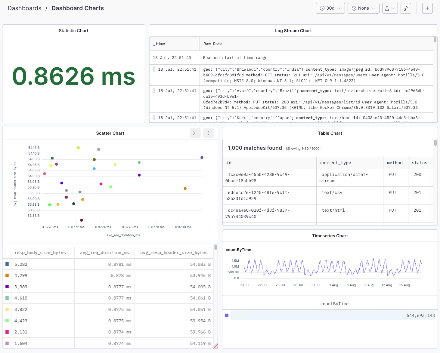
Log Stream Chart
The new Log Stream chart provides a real-time window into your system operations. Imagine tracking an ongoing deployment process or monitoring real-time user activity across your services - the Log Stream makes this possible by continuously streaming log entries as they arrive.
Axiom’s Log Stream chart provides a real-time experience with your logs which can be used for monitoring backend status health and request activity, providing a continuous stream of log data right at your fingertips.
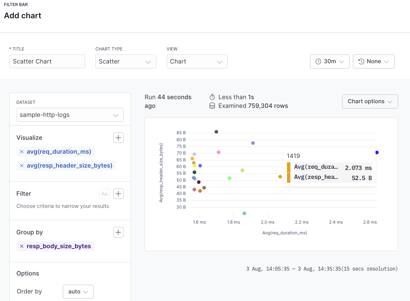
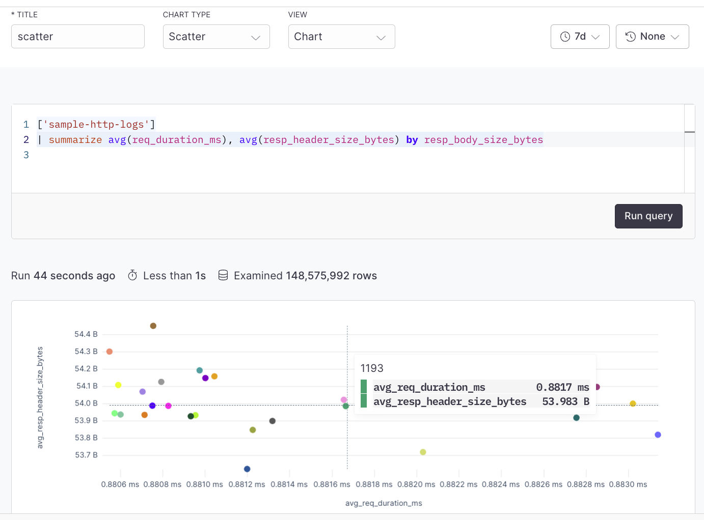
Scatter Plot Chart
The scatter chart type enables users to plot individual data points on a chart, where the value of each axis can represent a different metric or log field. Scatter charts can be utilized to illustrate the correlation between different metrics or the relationship between different fields within your logs or traces. For example, you might plot response size against response time for an API to see if larger responses are correlated with slower response times.
The power of these charts lies not just in their individual capabilities but in their combined use. For instance, you might use a Time Series chart to spot a spike in error logs, then switch to a Log Stream to investigate those errors in real-time and use a Filter Bar to focus on the most critical infrastructure errors.
Together, these new chart types allow you to pivot, drill down, and broaden your view as needed, providing a comprehensive observability solution for your logs, metrics, and traces.
Get started now
These new chart types complement the existing charts within Axiom, offering even greater flexibility for users to tailor their observability needs. These charts carry significant utility in transforming raw log, metric, and trace data into insightful, actionable information.
From visualizing key metrics that indicate system health (using Time Series and Statistic charts), to digging deep into log data (with the help of Filter Bar, Table, and Log Stream charts), or spotting Kubernetes issues (via Scatter charts), these new additions empower users to get the most out of their data.
Observability is more than just collecting data; it’s about understanding it. These new charts in Axiom make it easier than ever to observe, interpret, and act on your data. Now, you can gain deeper insights, resolve issues more quickly, and make more informed decisions about your infrastructure performance.
Explore these new chart types and start unlocking richer insights from your logs, metrics, and traces today. Check out the dashboard documentation to get started


