Axiom’s query experience is designed to give you the power to ask every possible question of your event data. But sometimes, even when you know something looks odd, it’s not obvious what the right question is. Is that spike in response times driven by one service? A single region? A sudden shift in request type? Finding the answer often requires trial and error.
With Spotlight, we flip this workflow on its head. Instead of iterating endlessly on queries, you highlight the region of interest in a chart, and Axiom automatically compares the selected events against baseline behavior. We provide a clear, short summary of what’s different, and back it up with intuitive visualizations. That way, you can jump straight to the root cause.
Spotlight is especially powerful for:
Root cause analysis: Understand why traces are slower, where errors originate, or what’s driving degraded performance.
Anomaly investigation: Quickly surface what makes outliers different from normal traffic.
Pattern discovery: Spot correlations and trends that might be buried in your data.
Spotlight in action
Before we jump into the details, let’s look at a quick example of Spotlight in action.
The chart below shows a heatmap of some trace durations.
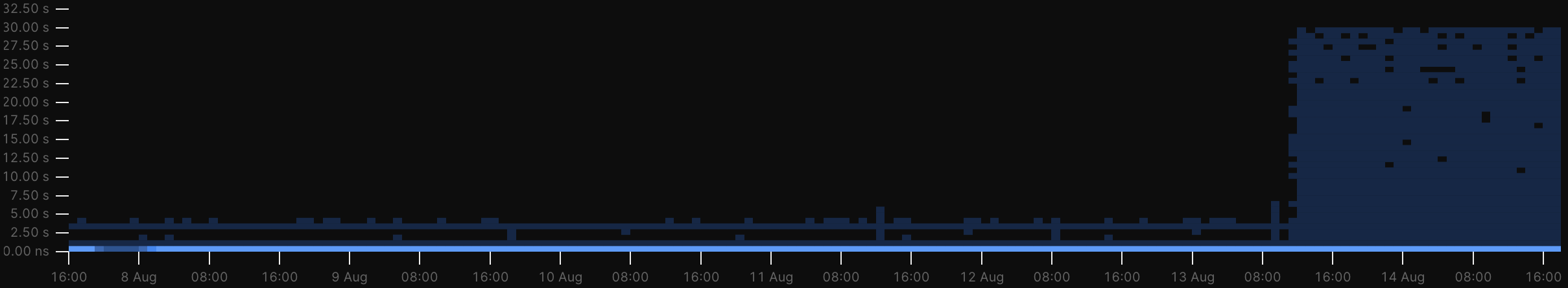
It’s clear that something about the system producing these traces has changed, leading to a large increase in long-running traces. But getting to the bottom of why this might be can often be a painful exercise in trial and error, especially if your dataset has a large number of fields to explore.
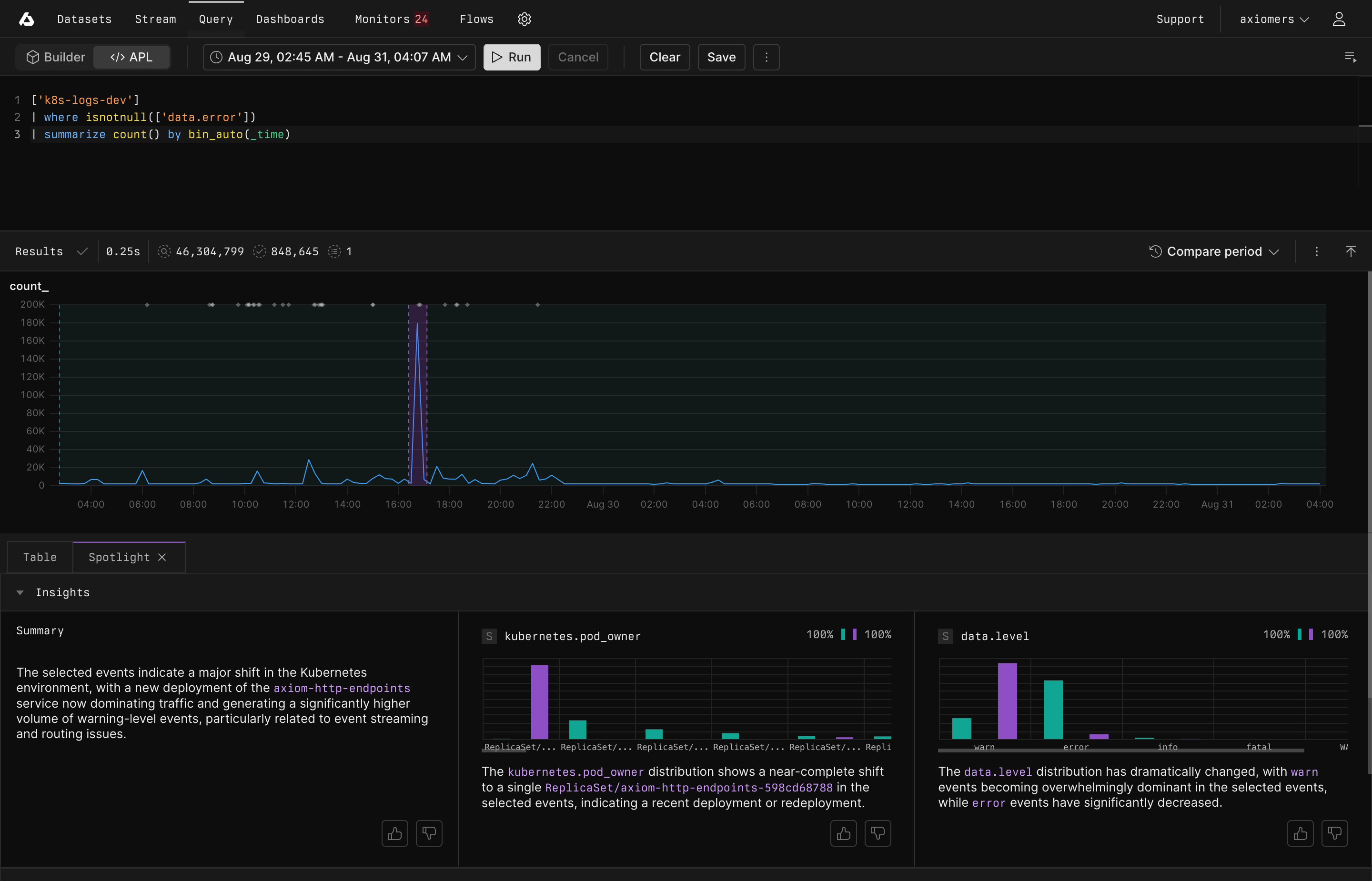
By simply selecting the slow traces and running Spotlight, insight is provided immediately:
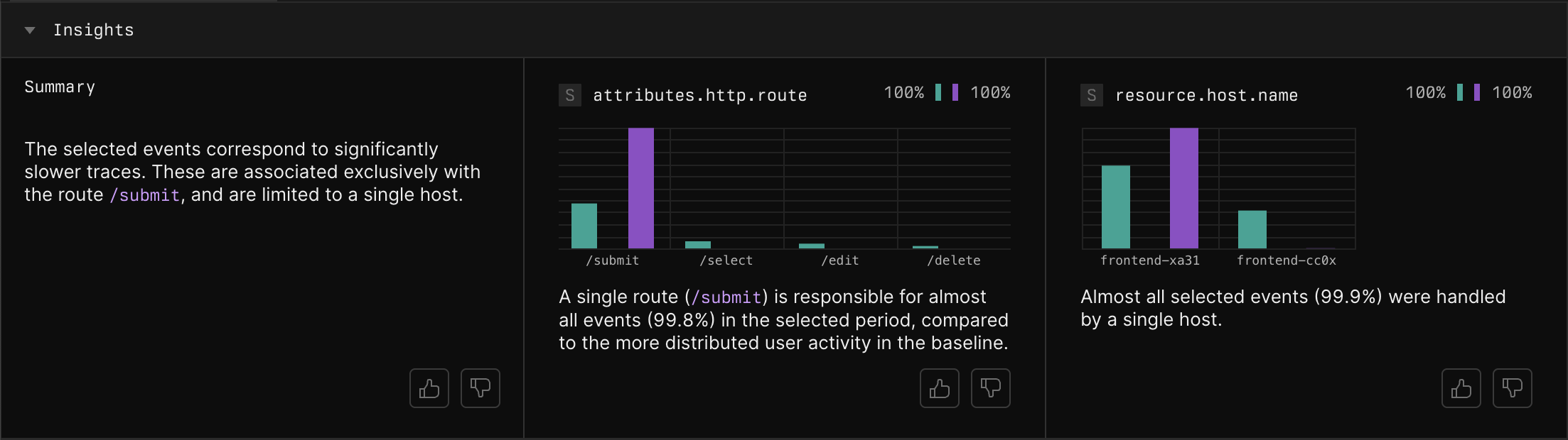
A brief summary gives you the high-level picture, and intuitive visualizations provide the evidence to back it up. In this case, the slow traces are limited to a single route, and the problematic host that seems to be causing it has been identified.
Analyze data with Spotlight
Select the events you want to investigate, and Spotlight highlights what makes those events different from the baseline across every field in your data so you can move from “something’s wrong” to “here’s why” in seconds.
After you select the region on a heatmap, line chart, or table that you want to investigate, Axiom takes over:
Automatically identifies the selected events.
Compares the values assumed in the selected events with the values assumed in the baseline events across all fields.
Identifies the fields with the most interesting changes.
Generates visualizations to help you understand the differences.
Passes the output of the analysis to a cutting-edge large language model.
Gives you a high-level summary of the key differences between the two sets of events.
As a result, you immediately see which attributes stand out.
Trust, but verify
LLMs are extremely well-suited to the problem of crunching an inhuman amount of data, identifying the most salient pieces, and spitting out a clear and understandable report. But they’re also good at spitting out nonsense, when inclined. We’ve engineered Spotlight’s summary feature to carefully evaluate the evidence, and to be conservative when offering conclusions, but we also believe you shouldn’t have to trust us on that.
In addition to the summary and top fields, Spotlight shows visualizations for how every field present in your dataset varies between the selected and baseline events, ordered to show first the fields that changed the most. This means you can always verify the summary output with cold, hard data, and ensures you have confidence in your conclusions. Spotlight also makes it easy to dig deeper if you need to, allowing you to right click on any visualization to filter by the corresponding field and re-run Spotlight, or jump to raw events where the selected value is present.
While other tools force you to choose between AI-generated insights you can’t verify or manual analysis that takes hours, Spotlight delivers both intelligent summaries and complete data transparency, getting you to an answer you can trust in seconds.
Context is king
How do we ensure that our Spotlight summaries are as trustworthy as possible? No two datasets are alike, and arriving at an accurate description of what’s different about a set of events requires understanding the context relevant to a particular dataset. To generate the summaries provided with Spotlight, we provide our models with access to a deep well of context about the query the user has run and the results they’ve received. In addition to the Spotlight results visible to the user, the model is also provided with sample events to help understand correlation between fields.
For example, if a spike in response times coincides with an increase in POST requests, that might show up in a few different fields: the request type, the affected endpoints, the payload size. By ensuring the model can see how the values for these fields are correlated, the model can determine that there’s a single underlying cause, and choose the fields that are most intuitive for the user to understand.
Example workflow
Spotlight is built for the daily problems engineers face. The following example illustrates how to investigate slow traces:
Create a heatmap of trace durations. For example, run the following query:
['otel-demo-traces'] | summarize histogram(duration, 20) by bin_auto(_time)Highlight the region where traces are slowest.
Run Spotlight to reveal whether latency correlates with endpoints, regions, or user segments.
Spotlight moves you from observation to explanation in one step.
Towards proactive intelligence
At Axiom, we are committed to building proactive intelligence into our product, and Spotlight is just one step on that journey. We believe that the data you send to Axiom is a vital source of context for your business, and our AI-powered toolkit will help you unlock the full value hidden within your raw event streams.
Whether you’re chasing down slow traces, sudden error spikes, or subtle shifts in user behavior, Spotlight quickly helps you find the “why” behind the anomaly. Check out our documentation to learn more, or just dive right in to your data and try it out.
Got feedback? You can react to summary output with a thumbs up or thumbs down to let us know. We’ll capture relevant context from the session to make sure Spotlight learns from this input on future runs.